| Image |
Comment |
| 11/01/2004 03:40:24 AM |
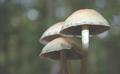
Fall's Starsby PatochComment by aznym: I think it's a good composition. The image doesn't look too appealing because of the low contrast. It looks hazy. I think slightly increasing the contrast would make a lot of difference to this one. |
 Photographer found comment helpful. Photographer found comment helpful. |
| 08/07/2004 03:35:31 AM |
|
| Photographer found comment helpful. |
| 08/04/2004 04:45:54 PM |
|
| Photographer found comment helpful. |
| 08/03/2004 11:50:55 PM |
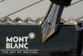
Mon stylo plumeby PatochComment by undieyatch: The nib says it all for me, a beautiful traditional writing instrument ....... Hardly a pen for most. Your endorsement would be more effective if you had included a sample of your penmanship......... |
| Photographer found comment helpful. |
| 08/03/2004 05:43:34 PM |
|
| 08/02/2004 01:20:05 AM |
|
| Photographer found comment helpful. |
| 07/30/2004 12:48:13 PM |
|
| 07/29/2004 09:04:17 PM |
Mon stylo plumeby PatochComment by carrieann: i like the pen tip its very nice, needs a little bit more sharpness, not really an everyday object to me. |
| 07/28/2004 02:56:30 PM |
|
| Photographer found comment helpful. |
| 07/28/2004 01:45:15 PM |
Mon stylo plumeby PatochComment by soniecat: That is a gorgeous pen. I think if you had used it in a more interesting setting...writing a letter in calligraphy or something it would have made a much better impact. It seems out of place here for something so ornate. The lighting and focus of the pen is great - and I know how hard it is to focus properly on reflective objects! The composition just needs a little work. [6] |
| Photographer found comment helpful. |
Home -
Challenges -
Community -
League -
Photos -
Cameras -
Lenses -
Learn -
Help -
Terms of Use -
Privacy -
Top ^
DPChallenge, and website content and design, Copyright © 2001-2026 Challenging Technologies, LLC.
All digital photo copyrights belong to the photographers and may not be used without permission.
Current Server Time: 07/16/2026 01:52:16 AM EDT.