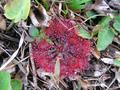
DPChallenge: A Digital Photography Contest You are not logged in. (log in or register
 
Browse Settings
Currently viewing:
Registered Userkaycee

Show comments:

Per page:

Order:

Comments:


Comments Received by kaycee
Pages:   ...
Showing 251 - 260 of ~283
Image Comment
Gentleman farmer making ready his first garden spot
12/22/2003 08:35:46 PM
Gentleman farmer making ready his first garden spot
by kaycee

Comment by Polar7:
Fantastic blurring effect. Great colors. A man at work but still in his own world.
Photographer found comment helpful.
No brainer . . . it's a strainer!
12/22/2003 04:53:12 PM
No brainer . . . it's a strainer!
by kaycee

Comment by Frankie_Lv:
Nothing of interest at all here and the lights in the background are a major distraction.
Sundew:  Tiny Carnivore - Macro
12/21/2003 09:14:10 AM
Sundew: Tiny Carnivore - Macro
by kaycee

Comment by Konador:
I think the composition is too centered, it's too clustered, and the colours are too flat. 3
Photographer found comment helpful.
Sundew:  Tiny Carnivore - Macro
12/21/2003 08:39:45 AM
Sundew: Tiny Carnivore - Macro
by kaycee

Comment by Beagleboy:
I know firsthand how small these guys are. Good job.
Photographer found comment helpful.
Sundew:  Tiny Carnivore - Macro
12/19/2003 11:34:57 AM
Sundew: Tiny Carnivore - Macro
by kaycee

Comment by jmsetzler:
'water' is a bit weak for the subject of this photo.
Photographer found comment helpful.
Hard and Soft of Rural Life
12/19/2003 05:55:31 AM
Hard and Soft of Rural Life
by kaycee

Comment by e301:
No comments? Outrageous ... so here's one.

Intersting to read your comments on the shot - and an interesting idea, and approach. Like the variable soft focus of the misted lens trick.

The composition lets you down somewhat though - as much in that the farm implement isn't recognisable at all, and the dead-centre positioning of your main subject. This way the flower becomes the sole sibject of your image, and the rusted thing merely the background - if you were to include enough of the rusted thing to make it recognisable, and place the flower at a stronger part of the frame I think you'd have a more successful photograph - put simply, there'd be more going on to hold interest: the tric being to compose the image so that the areas of interest are prioritised to your audience.

Ed
Shape of Leaves to Come
12/19/2003 05:43:31 AM
Shape of Leaves to Come
by kaycee

Comment by e301:
from the Critique Club

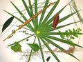
A suggestion: turn off the on-board flash on your camera. Light the scene with one or two desk lights (one from each side); put camera on tripod (a tripod is the one essential for this kind of stuff, unless you have really bright lights available), lock focus and exposure on an area with both the white background and some leaf, and press shutter release - make a note of the settings your camera chose, and then switch to manual mode: set aperture and shutter speed accordingly, adjusting to a smaller or wider aperture and faster or slower aperture depending on whether you think your first shot is over- or under-exposed. Play with different angles of light, and lighting from different distances. One of the great benefits of digital is that you can keep shooting and ahooting, and see your results as you change things. I guarantee you'll get a more pleasing photograph...

Because I think it's the light that more than anything lets this shot down. With the source of light being directly from the camera, it leaves very little, if any, graduation of light across the leaves for the camera to read - and that is where the definition of the shapes and texture of a subject comes from. Texture only becomes visible when side-lighting is used, as texture, in a photograph, is only the fact of there being small areas of shadow and highlight where the light shines against hollows and lifts in your subject - with light coming from the same angle as you shoot, all those areas are equally bright, and thus appear the same to the camera.

There are a few other points: was it really more effective to have the leaves going out of frame than keeping everything in shot? Whilst the contrast of shapes is interesting, perhaps there's too many varieties present here? Would a simpler composition have been more effective?

Hope some of this helps

Ed
Sundew:  Tiny Carnivore - Macro
12/19/2003 01:48:49 AM
Sundew: Tiny Carnivore - Macro
by kaycee

Comment by TooCool:
The focus just seems a touch off here. Colors are very nice as are the textures. I could tell it was a macro though without the hint...
TC
Photographer found comment helpful.
Sundew:  Tiny Carnivore - Macro
12/18/2003 10:37:43 PM
Sundew: Tiny Carnivore - Macro
by kaycee

Comment by nborton:
if you were going for a macro shot i would have gotten even closer to the subject. also the leaf in the bottom center of the picture is in the way of your subject and is slightly distracting.
Photographer found comment helpful.
Sundew:  Tiny Carnivore - Macro
12/18/2003 06:52:45 PM
Sundew: Tiny Carnivore - Macro
by kaycee

Comment by dagaleaa:
very interesting subject!
Photographer found comment helpful.
Pages:   ...
Showing 251 - 260 of ~283


Home - Challenges - Community - League - Photos - Cameras - Lenses - Learn - Help - Terms of Use - Privacy - Top ^
DPChallenge, and website content and design, Copyright © 2001-2025 Challenging Technologies, LLC.
All digital photo copyrights belong to the photographers and may not be used without permission.
Current Server Time: 09/16/2025 11:39:03 PM EDT.