| Image |
Comment |
| 03/26/2004 11:44:50 AM |
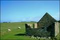
Country Livingby xburnerxComment by Dave Gordon: I could picture this as a magazine cover, except that magazines almost universally use vertical format shots. I really like the colors and textures; it's almost like a painting. |
 Photographer found comment helpful. Photographer found comment helpful. |
| 03/26/2004 10:12:02 AM |
bittersweet distractionby xburnerxComment by jodiecoston: It took me a minute to figure out what this was. I love the lines, lighting and the off-center composition, which is pulled together by the line of shadow in the background that continues from the subject through the negative space of the image. Very creative, well done shot! 8 |
| Photographer found comment helpful. |
| 03/23/2004 03:52:40 PM |
Country Livingby xburnerxComment by nborton: it might be the perspective, but the building appears as though it is leaning toward the left. i really like the strong greens and blues. |
| Photographer found comment helpful. |
| 03/23/2004 02:34:09 PM |
Country Livingby xburnerxComment by tyt2000: Beautiful scene and colors. Great composition. Seems a little bit tilted to the left (you can tell from the house's wall), but thats ok. I would definitely see this on a magazine. 9
Good luck... |
| Photographer found comment helpful. |
| 03/23/2004 09:06:12 AM |
Country Livingby xburnerxComment by rananculus: wow, a pristine shot, but I'm confused. Is your subject the building, or the sheep, or the landscape? The building is cropped to tightly, and you have room to the left to eliminate some unnesessary information. Nice work |
| Photographer found comment helpful. |
| 03/23/2004 05:12:08 AM |
Country Livingby xburnerxComment by cbonsall: nice picture but.....
(I'm writing this to everyone who submitted a landscape shot) The challenge was to produce a shot worthy of a magazine cover but to me a shot like this is not suitable to be put on a "portrait" format magazine.
---ADDITIONAL---
Due to forum discussions and accusations that marking landscapes down is nitpicking, I'm going through them and remarking. I still think some of the landscapes would not make good covers because of their orientation but I am no longer marking down because of that.
I still think landscape is inapropriate for the majority of magazines but I'll give the benefit of the doubt to the photographers. |
| 03/23/2004 12:15:13 AM |
Country Livingby xburnerxComment by ChrisW123: Ack it's tilted to the left. :( Not more but it's noticable for sure. Otherwise it's really cool. What I really like about this (and which fits the "magazine title" thing) is the how there is green in the bricks of the building which I think fits the theme well and blends in with the green of the pasture. |
| Photographer found comment helpful. |
| 03/22/2004 08:06:04 PM |
|
| Photographer found comment helpful. |
| 03/22/2004 07:36:59 PM |
Country Livingby xburnerxComment by admart01: you've composed this shot well and left that ever-important negative space for text. One of my favorites this challenge. |
| Photographer found comment helpful. |
| 03/22/2004 03:33:22 PM |
|
Home -
Challenges -
Community -
League -
Photos -
Cameras -
Lenses -
Learn -
Help -
Terms of Use -
Privacy -
Top ^
DPChallenge, and website content and design, Copyright © 2001-2026 Challenging Technologies, LLC.
All digital photo copyrights belong to the photographers and may not be used without permission.
Current Server Time: 07/16/2026 09:14:53 PM EDT.