| Image |
Comment |
| 04/13/2005 01:08:56 PM |
|
 Photographer found comment helpful. Photographer found comment helpful. |
| 04/13/2005 01:14:05 AM |
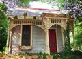
Le Garconierreby TruegshtComment by andri: A fun and colorful photo!
However, there are certain things here that irritate me.
1) I really, really don't like the overexposed white area above the house. A shorter exposure time and perhaps shooting in RAW-format might have helped here.
2) Instead of tilting the lens up you should instead tried to be somewhat further away from the building (and/or zoom away) and shoot straight on without tilting the camera and then crop in postprocessing.
3) I'd be curious to see more of the enviroment around the house.
4. I don't like how the columns to the left of the door obscure it. You should have been more the the right when taking the picture.
5) Perhaps some unsharp mask might have helped here? |
| Photographer found comment helpful. |
| 04/03/2005 03:41:32 PM |
What the "duck" are you looking at?by TruegshtComment by deapee: Greetings from the critique club...
Your composition is pretty good. I like the focus being on the head, and not including too much other than what's necessary to get your point across. The saturation seems like it might be a little too much, although I guess it's possible that it came out of the camera that way.
Your focus is just about spot on -- try to get it right on the eye always when shooting animals -- which is apparently what you did here, good job. There is a lot of pixelation in the grass in the background. I'm not sure if that's a result of jpg compression or from a bump in saturation, either way, probably not going to be too desireable as a 'stock image'.
Your score seems right on par. 5.4 -- that's pretty good. Good shot and keep shooting! |
| Photographer found comment helpful. |
| 03/31/2005 07:48:04 AM |
Remembranceby TruegshtComment by Matthew: Like the motion in the flag and strong colours. background is a little distracting - chain link not up there with the best of background imagery!
Without wishing to offend, the patriotic call implicit in the flag may switch off some non-US voters - very slightly cheapens the image for me as it feels as though the symbol is being used to evoke an emotive response that the picture would not otherwise demand. |
| Photographer found comment helpful. |
| 03/30/2005 07:17:30 PM |
Remembranceby TruegshtComment by rex: I am making two passes on this Challenge. I will vote on your photo then return later(before voting is over) to comment on what I like and dislike about your shot. You can take the comments however you wish and I will try not to be mean. Just don't take it the wrong way.
--------------------------------------------------------------------------------------------------------------
I think you should have focused on the flag rather than the headstone. |
| Photographer found comment helpful. |
| 03/29/2005 09:51:48 AM |
|
| Photographer found comment helpful. |
| 03/29/2005 09:18:43 AM |
|
| Photographer found comment helpful. |
| 03/29/2005 07:55:13 AM |
Remembranceby TruegshtComment by clarmore: Good picture =) I think it would have been stronger if you changed the composition... the flag should wave into the picture, not out of. It leads the out out of the photograph. Also the tombstone looks a little over-exposed. However, good job =) |
| Photographer found comment helpful. |
| 03/28/2005 08:20:15 PM |
|
| Photographer found comment helpful. |
| 03/27/2005 12:52:55 AM |
|
| Photographer found comment helpful. |
Home -
Challenges -
Community -
League -
Photos -
Cameras -
Lenses -
Learn -
Help -
Terms of Use -
Privacy -
Top ^
DPChallenge, and website content and design, Copyright © 2001-2026 Challenging Technologies, LLC.
All digital photo copyrights belong to the photographers and may not be used without permission.
Current Server Time: 07/16/2026 06:47:21 PM EDT.