| Image |
Comment |
| 05/08/2005 05:42:49 PM |
|
| 05/07/2005 03:14:33 PM |
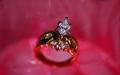
Today, Tomorrow, Forever....by TruegshtComment by HBunch: *Critique Club*
Wow. That is a lot of pink/red. I do find it a bit distracting, especiall since there is a curved seperation between the 2 different colors of background. It looks almost like a light source, but non the less, it is curved right through the ring and while we look at the ring, our eyes want to follow that curve. for me anyway.
The focus seems ok, but the DOF is too shallow in my opinion. I'd like to see the entire ring in focus, would help me to want to buy the ring. As is, I can only see the diamond, and while that is really pretty, I don't know if I'd buy it if it were on an ugly gold band. I can't see the band to know if I'd like it or not.
The angle you chose for the ring is nice. I like the tilt and the lower placement is nice as well.
I think the part that really is bothering me about the photo is that the gold band has absorbed the background color and is redish. What I want to see is somehow getting the whole ring in focus without the red reflecting in the band. Otherwise, the setup is neat and I think it would be an effective ad.
~Heather~ |
 Photographer found comment helpful. Photographer found comment helpful. |
| 05/07/2005 09:29:03 AM |
Fruity Fivesby TruegshtComment by dafragsta: mmmm... apple jacks. I think the colored light is overused (hardly any of the original subject's tone remains.) and the pic has been sharpened to hell and gone. Interesting idea. An interesting angle might've helped too. |
| 05/07/2005 02:49:00 AM |
|
| 05/07/2005 02:40:15 AM |
|
| 05/03/2005 01:45:14 PM |
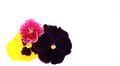
Color me Springtimeby TruegshtComment by fifield: it looks to me like when yo uadjusted to get the white background, you lost detail in your flowers, so they're just areas of color |
| Photographer found comment helpful. |
| 05/02/2005 09:33:59 AM |
Color me Springtimeby TruegshtComment by JelloPhotog: one would have been succesful, two sufficient, three is too many. Webster - "a style or technique (as in music, literature, or design) that is characterized by extreme spareness and simplicity" Simplicity in number as well as color. |
| Photographer found comment helpful. |
| 05/01/2005 06:19:28 PM |
Color me Springtimeby TruegshtComment by lastef: Beautiful colors, maybe only the red flower would have made this picture stronger but it is not in harmony as I see it. |
| Photographer found comment helpful. |
| 05/01/2005 05:31:03 PM |
|
| Photographer found comment helpful. |
| 05/01/2005 11:21:13 AM |
|
Home -
Challenges -
Community -
League -
Photos -
Cameras -
Lenses -
Learn -
Help -
Terms of Use -
Privacy -
Top ^
DPChallenge, and website content and design, Copyright © 2001-2026 Challenging Technologies, LLC.
All digital photo copyrights belong to the photographers and may not be used without permission.
Current Server Time: 07/17/2026 02:52:57 AM EDT.