| Image |
Comment |
| 06/18/2012 08:27:44 AM |
|
 Photographer found comment helpful. Photographer found comment helpful. |
| 06/15/2012 11:27:03 AM |
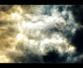
Good vs. Evilby JamesDowningComment by eschelar: Grand. In the thumbnail, I thought there was a face hiding behind the light, but seeing that it is the sun behind clouds, I'm wrong, but not disappointed.
What really makes this (aside from the coloring) is the change in texture of the cloud shapes which seem more flowing and dynamic on the left and static and unmoving on the right. Pretty good stuff! |
| Photographer found comment helpful. |
| 06/15/2012 11:23:17 AM |
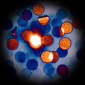
Floaties°by JamesDowningComment by eschelar: I don't even really know for sure what I'm looking at, but I think I like what I see. It could be pennies tossed in the air, or microorganisms under a microscope. I could be looking from pretty much any vantage point in any direction. It makes me feel ungrounded and uncertain about where I actually am.
So that's pretty much got it exactly right then. Message edited by author 2012-06-15 11:24:58. |
| Photographer found comment helpful. |
| 06/14/2012 04:16:18 PM |
|
| Photographer found comment helpful. |
| 06/14/2012 04:11:49 PM |
Floaties°by JamesDowningComment by GeneralE: Right off this reminded me of one I took a while ago ... in comparison to your picture I chose to create a more "colorful" (but perhaps less realistic-looking) version, and I used the circular vignette to try and give the impression of a micro-photograph. Otherwise, you did a nice job capturing the details and textures.
 |
| Photographer found comment helpful. |
| 06/14/2012 01:47:42 PM |
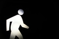
The Walking Manby JamesDowningComment by RyanW: looks like he could stand to walk a few excess pounds off
(trying to comment on all, sorry if my wit is not up to par) |
| Photographer found comment helpful. |
| 06/14/2012 07:21:40 AM |
|
| Photographer found comment helpful. |
| 06/14/2012 05:39:25 AM |
|
| Photographer found comment helpful. |
| 06/13/2012 03:40:22 PM |
|
| Photographer found comment helpful. |
| 06/13/2012 01:38:47 PM |
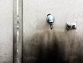
drip dripby JamesDowningComment by EL-ROI: I like where you were going with this. I think some simplification of the scene would have sent this over the top. Removing the left hand side of the photo and focusing on the two objects would have been brilliant, simple and mundane! The joint in the wall adds clutter and doesn't strengthen the image. The composition would then have been light at the top and dark at the bottome to anchor the photo with the two shapes in the middle somewhere to add interest. |
| Photographer found comment helpful. |
Home -
Challenges -
Community -
League -
Photos -
Cameras -
Lenses -
Learn -
Help -
Terms of Use -
Privacy -
Top ^
DPChallenge, and website content and design, Copyright © 2001-2026 Challenging Technologies, LLC.
All digital photo copyrights belong to the photographers and may not be used without permission.
Current Server Time: 05/06/2026 05:40:50 PM EDT.