| Image |
Comment |
| 05/07/2002 11:19:00 PM |
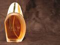
Realmby shortredneckComment by drewmedia: My two suggestions are first that the "L" in realm is lost a little on the lighting, and the company might not like that. Second, did you try ruffling the background up at all? I like the spots where it's rougher, and I think that might have looked cool if it were done with all the fabric. |
| 05/07/2002 10:23:00 PM |
Realmby shortredneckComment by Reign: Handsome bottle and rather difficult to shoot. It looks like you had a little problem with lighting but well…it happens. Your choice of backgrounds compliments the bottle and the coloring of the perfume. The texture adds a softness. I'm not sure about the empty space to the right. At first glance it would seem like poor composition. But it seems to intentional to be that so I'm not going to assume. I ran auto levels on the image and it really balanced out the colors well and provided a more expensive look. Did you not like that look? Good job on meeting the challenge. |
| 05/07/2002 07:22:00 PM |
Realmby shortredneckComment by Speigner: dramatic composition, i like that you left space on the right to put ad copy, but it needs to have a little more care taken in lighting, specifically the product name is hard to read and the top is distractingly shiny |
| 05/07/2002 05:55:00 PM |
|
| 05/07/2002 05:06:00 AM |
Realmby shortredneckComment by itsaghostcar: beautiful. I really like the texture of the background. Goes very well with the colour of the perfume. My only gripe would be that the reflections don't really fit in. The top of the bottle has some quite large reflections which cause a distraction, and the product name is lost slightly ... it is quite hard to read the 'L' and 'E' of 'REALM' and 'WOMEN' respectively |
| 05/07/2002 04:39:00 AM |
Realmby shortredneckComment by yyyap: i like the large void you leave on the right. the grainy fabric you chose for a background is also mysterious and warm. the bright cap is interesting. only thing i feel wanting is the writing on the bottle. |
| 05/07/2002 02:51:00 AM |
Realmby shortredneckComment by lisae: I think the colour of the background is a bit dull to give the impression of richness and luxury you were after, although the variations in the colour and the overall texture is nice. Nevertheless, it's not nice enough to take up that much of the photo. The lighting is effective, but too strong, making the reflections on the lid blow out. The name of the product isn't clear... I can work out what it is, but in an advertising shot it would have to be 100% readable. Otherwise a nice imitation of a perfume ad. |
| 05/06/2002 10:43:00 PM |
|
| 05/06/2002 07:02:00 PM |
Realmby shortredneckComment by Paulo: Can't read what is written on the bottle. Violates the first law of advertising - "let em know what the product is"! |
| 05/06/2002 06:48:00 PM |
|
Home -
Challenges -
Community -
League -
Photos -
Cameras -
Lenses -
Learn -
Help -
Terms of Use -
Privacy -
Top ^
DPChallenge, and website content and design, Copyright © 2001-2026 Challenging Technologies, LLC.
All digital photo copyrights belong to the photographers and may not be used without permission.
Current Server Time: 05/31/2026 09:10:21 PM EDT.