| Image |
Comment |
| 11/26/2004 11:12:24 PM |
Authorityby speaseComment by biggood53: Don't mean to be negative but the red line is a bit distracting, otherwise great pic. 8 |
 Photographer found comment helpful. Photographer found comment helpful. |
| 11/26/2004 10:23:44 PM |
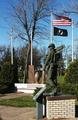
Anoka MN herosby speaseComment by graphicfunk: From the critique club:
A very nice image and very well framed. I would have focused on the soldier, but even so, it is not going to add any more interest. You did as good as anyone would have with this subject. The image certainly spells out its story and monument and flags reinforces the intent. Possibly needed was a subject, like somebody reading the inscription. Oftentimes, this is the problem of capturing these type of images, yes, they are good but when entering a challenge you want that extra touch.
You obviously know your way with the camera therefore the concern is more with just how it is that you want to present the image. Sometimes I see the possibility for a shot and I begin to visualize the best way that I would like to see the image. Sometimes we need to search and search until an idea excites us. I realize that models are not easy to come by, but hey, you could consider jumping right into the picture. Here you could looked at the inscription or look up at the face of the soldier. Sometimes, when a sight is ideal, I even return for the final shoot. So my advise is you know how to take a picture, but pay extra interest when you consider entering an image. Ask yourself, is there anything else that I can do to make this image more competitive. Look forward to seeing your future efforts. Message edited by author 2004-11-26 22:25:28. |
| 11/26/2004 05:39:55 AM |
Authorityby speaseComment by Skip: not quite sure what to say here. yes, you have a symbol of authority, and it is also obvious that you have a decent camera. i also think this image could use some work. the lighting is fine, except for blowing out the edge of the badge--that is a major distraction--the textures are undone by the badge. also, i can't tell what is in the foreground. it has an interesting pattern, but beyond that, it is not really adding anything to the image. i think you had the makings of producing a good image, and would definitely recommend revisiting it to see if you could pull out something a bit stronger. |
| Photographer found comment helpful. |
| 11/26/2004 02:20:42 AM |
passing timeby speaseComment by Bud: This is a good idea, but the hands of the clock are too light. I am not sure how you could get them darkerm other than to do a longer exposure by unplugging (or taking the battery out) the clock and moving the hands manually and using a longer exposure. |
| 11/25/2004 05:46:07 PM |
Authorityby speaseComment by strags: It might have been interesting to take this from more of an angle, and not have the badge dead-center. Also, the glare on the left of the badge is a pity. |
| Photographer found comment helpful. |
| 11/25/2004 04:56:46 AM |
passing timeby speaseComment by snackwells: Connection with challenge theme: Strong, literal/concrete
Technical merits: Good focus and detail. Sharpened adequately. Lots of scratches and imperfections which could have been rectified under advanced editing rules. A levels adjustment or contrast adjustment would have given this more punch as well as darken the numerals. Cropping is somewhat inadequate in the sense that there is a fair amount of dead space to the right.
Artistic merits: I think you chose a good clock to work with. This image has a lot of potential. I think the shadow on the top portion should have been eliminated by repositioning the clock face or adjusting your lighting.
Overall: You took a literal take on the challenge theme and used a concrete approach which was flawed by technical and artistic issues as described above. |
| 11/24/2004 10:09:17 PM |
|
| Photographer found comment helpful. |
| 11/24/2004 11:57:20 AM |
Authorityby speaseComment by vontom: Good composition, good tones, but the one highlight to the left of "POLICE" is distracting. |
| Photographer found comment helpful. |
| 11/24/2004 05:34:48 AM |
|
| Photographer found comment helpful. |
| 11/24/2004 01:15:45 AM |
Authorityby speaseComment by KDO: Nice light, textures, and colors. The light on the badge works well. The photo meets the challenge for me. |
| Photographer found comment helpful. |
Home -
Challenges -
Community -
League -
Photos -
Cameras -
Lenses -
Learn -
Help -
Terms of Use -
Privacy -
Top ^
DPChallenge, and website content and design, Copyright © 2001-2026 Challenging Technologies, LLC.
All digital photo copyrights belong to the photographers and may not be used without permission.
Current Server Time: 06/11/2026 02:10:39 AM EDT.