| Image |
Comment |
| 08/12/2004 02:35:31 PM |
|
 Photographer found comment helpful. Photographer found comment helpful. |
| 08/10/2004 11:27:56 PM |
|
| Photographer found comment helpful. |
| 08/10/2004 04:56:28 AM |
|
| Photographer found comment helpful. |
| 08/09/2004 07:01:06 PM |
|
| Photographer found comment helpful. |
| 08/09/2004 12:47:59 AM |
|
| Photographer found comment helpful. |
| 08/09/2004 12:44:31 AM |
Samantha152by cbellerComment by KevinRiggs: Chris,
Wow!
Let me try again: WOW!
Yeah, that was closer to what I meant. Dude, this is awesome. You blew the doors off with this one. Sweet buttermilk biscuits, that's an incredible shot. The lighting, the composition . . . if I ever got speechless this would be the time (thank God I can still type, though). You got a shot where the model filled the frame, you got a great depth of field (awesome bokeh on the trees to generate the separation between your subject and her environment). I like the light on the face (no catchlight but the angles, tones and texture are what generate the story in this shot so that's not a negative here). The only thing I'd say (and this is no criticism of the model as everyone has physical quirks that make them unique) is that the sharp line of demarcation on her nose makes it stand out due to the incredible quality of the rest of the shot. I don't think you would have wanted her to turn her head anymore (thus keeping the nose from breaking the plane of the cheek) but you might want to selectively highlight the brighter edge of that noseline and give it a little fade or drop the contrast or something. Then again, I can't imagine anyone ever getting a shot that better captures the essence of a look from this model. Others may take a shot thats as good as your capture of her but I can't see anyone taking one better. You really hit a homerun with the elements of this one IMO.
Looks like good post-shot production work, too.
Congrats,
Kev |
| Photographer found comment helpful. |
| 08/09/2004 12:36:32 AM |
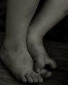
Samantha139by cbellerComment by KevinRiggs: Chris,
Love this pose and the outfit. I think this has a few elements that you might want to think about. Your lighting here is decent but not up to the 1st, 3rd and 4th pictures that you posted (sure hope you remember the order). Just a little more fill would have helped this out (like I should be telling anyone to use fill flash). You got awefully close to the model's toes on her left foot with the crop but at the top of the shot you have some tree limbs that don't completely fill across the frame with gives an incomplete kind of feeling to the crop up there (IMO). Added to the limbs are some power/telephone wires that are visible. Those would probably be a quick clone out if you were going to use this in a portfolio but I figured they were worth mentioning. Now as for composition I find little in any of these shots to fault you on; maybe just some ideas that you might want to try and see if they fit your style. Since you have a model who is pretty thin and you're shooting her at more of a profiled angle alongside a light pole and seeing as how you have another vertical pole in the background with a slanted line of demarcation (the grass/water line), you might want to try playing with tilting the camera so that you're not shooting her straight on vertical. Maybe having the model lean farther back or putting her feet farther forward so that her back is at more of an angle and then tilting the camera until she comes into plumb vertically will throw off all the other lines in the shot and give it an arbitrary sense of style (at least IMO). Its not to say this is a bad shot, just something that if you start setting up a shot like this and noticing similar elements you might want to play with that idea for a few frames next time and see if you like the effect.
Kev |
| Photographer found comment helpful. |
| 08/09/2004 12:27:38 AM |
Samantha009by cbellerComment by KevinRiggs: Chris,
Great lighting. Fantastic lighting. Love the slight catchlight in the eyes (could be a little more pronounced), the lips (perfect there) and the shoulder (gives a sun-kissed kind of look). The setting is wonderful; it provides a nice backdrop that with several elements but you've managed to capture it with some blur to keep it from competing too much with the subject yet the color and texture of the rocks and grass can be appreciated for enhancing the smoothness of the model's skin. They kind of allow you to show her feminine smooth side without resorting to a "plasticky" feel that something like too much NeatImage might give you. Now this is just a nit from my initial view of the shot; keep in mind that I think this is a great photo. I think that in this pose if you'd had the model turn her hips more in profile it would have accentuated her femininity a little better. Say, something like taking the knees around about 4-6 inches to the model's right would have closed her hips more to you but left her upper body at roughly the same angle. This would have helped to accentuate her chest and back curves. As it is the edge on look at the subject's left arm shows that she is a young lady with little body fat content as her arm looks trim. While she doesn't look large at all, there is an illusory discrepancy between how thin her arm looks and how full her chest looks at about bicep level. Added to that (IMO) is the line across her hips such that if her hips were closed just a little more to the camera it would tend to downplay the illusion that her arm is too thin for her body (I think the dark shadow down the her tricep adds to that feeling).
Kev |
| Photographer found comment helpful. |
| 08/04/2004 06:39:25 PM |
Pollinationby cbellerComment by Dr.Confuser: Good workmanlike bug pic. Feels about middle of the pack for this genre. I lose the wings against the background. there is wonderful detail there. Against a bright background, it would have been more dramatic. Good luck. |
| Photographer found comment helpful. |
| 08/04/2004 05:24:28 PM |
Zabrinaby cbellerComment by Ecce_Signum: Great shot :) I would have liked to have seen more of the tree in this shot and maybe less at the top of the shot. Being hyper critical, there are 3 hotspots that take my vision away from this great image (on her back on the left edge, above the upper arm and above the wrist) mind you, that was after spending some time trying to find something you could improve upon. |
| Photographer found comment helpful. |
Home -
Challenges -
Community -
League -
Photos -
Cameras -
Lenses -
Learn -
Help -
Terms of Use -
Privacy -
Top ^
DPChallenge, and website content and design, Copyright © 2001-2026 Challenging Technologies, LLC.
All digital photo copyrights belong to the photographers and may not be used without permission.
Current Server Time: 07/16/2026 05:56:14 PM EDT.