| Image |
Comment |
| 01/05/2004 06:09:25 AM |
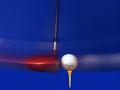
Top Flightby wwjdwithcaComment by jonpink: tee peg looks odd as if floating. Apart from that great shot. TaylorMade bubble again I see ;) |
 Photographer found comment helpful. Photographer found comment helpful. |
| 01/05/2004 12:31:33 AM |
Top Flightby wwjdwithcaComment by Gracious: This is very good. Has me studying it. Nicely executed. The golf ball is a bit burned in one spot, losing detail. |
| Photographer found comment helpful. |
| 01/03/2004 02:54:35 PM |
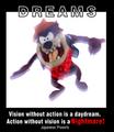
Dreamsby wwjdwithcaComment by RonB: I like the black on white/white on black hollow text at the top. Overall, the image is too bright for my taste, and the focus on the monster too soft. |
| Photographer found comment helpful. |
| 01/02/2004 08:16:54 PM |
Dreamsby wwjdwithcaComment by RHoldenSr: Very nice work.
I like the font on Dreams.
I do not like the font at the bottom.
Japanese Proverb should have been smaller and in ( ) I think.
The image seems to be somewhat washed out a little with all the lighting.
Still very nice work and efort. |
| Photographer found comment helpful. |
| 01/02/2004 11:09:57 AM |
Dreamsby wwjdwithcaComment by dr rick: The photo does seem nightmarish, although unnecessarily washed out. It would be a bit zany by itself, but works in the context of the poster. Splitting the word "DREAMS" was a good idea, but white lines on a black background look thicker than the opposite, so top and bottom don't really match. |
| Photographer found comment helpful. |
| 01/02/2004 05:35:12 AM |
Dreamsby wwjdwithcaComment by birgir: To much photoshop exspeciali the text. DREAMS on the top is ugly and I just can't see anything I like here. Sorry ... 2 |
| 01/01/2004 02:07:32 PM |
|
| Photographer found comment helpful. |
| 01/01/2004 11:57:34 AM |
Dreamsby wwjdwithcaComment by MWitt: I get it. I think the text at the bottom is a little too strong, too large and distracting. |
| Photographer found comment helpful. |
| 12/29/2003 08:57:24 AM |
Dreamsby wwjdwithcaComment by kaycee: Pretty funny picture - but doesn't really seem to fit the quote to me. Nice typography. |
| Photographer found comment helpful. |
| 12/29/2003 06:17:42 AM |
Dreamsby wwjdwithcaComment by timmi: You are mixing too many different text styles for this to bee effective. The text on the top of the image is too much. It's heavy and half reversed. I am not sure about this motivationg me into anything else but running away from it. |
| Photographer found comment helpful. |
Home -
Challenges -
Community -
League -
Photos -
Cameras -
Lenses -
Learn -
Help -
Terms of Use -
Privacy -
Top ^
DPChallenge, and website content and design, Copyright © 2001-2026 Challenging Technologies, LLC.
All digital photo copyrights belong to the photographers and may not be used without permission.
Current Server Time: 07/18/2026 12:00:21 AM EDT.