DPChallenge: A Digital Photography Contest You are not logged in. (log in or register
 
Browse Settings
Currently viewing:
Registered UserRUEDISCHMUTZ

Show comments:

Per page:

Order:

Comments:


Comments Received by RUEDISCHMUTZ
Pages:   ... [311] [312] [313] [314] [315] [316] [317] ... [364]
Showing 3131 - 3140 of ~3637
Image Comment
Ready to go
07/29/2004 02:17:00 AM
Ready to go
by RUEDISCHMUTZ

Comment by AfterHim:
I've never seen a key like that blue one :)

I like the reflection
Photographer found comment helpful.
Ready to go
07/28/2004 04:40:29 PM
Ready to go
by RUEDISCHMUTZ

Comment by Skip:
ok, this works for me. nice lighting, dof, basic composition. would probably like to see this with different colored backgrounds.
Photographer found comment helpful.
Balancing the ball for a living
07/25/2004 05:55:22 PM
Balancing the ball for a living
07/24/2004 03:20:30 AM
Balancing the ball for a living
by RUEDISCHMUTZ

Comment by Stagolee:
Shows balance well but i think it is a touch dark.
I believe I can fly
07/23/2004 05:38:13 PM
I believe I can fly
by RUEDISCHMUTZ

Comment by admart01:
Hello Ruedi:

Greetings from the Critique Club...

(I see you have met your goal of having some top ten finishes. I also noticed that you have received many comments but not made any)

This is an excellent panning shot with the three main subjects in crisp focus. The fact that their wings are in three different stages adds interest. You have given them some negative space on the right to fly into and that adds a good feel to the composition. This is a technically well-executed shot.

I was puzzled by the low number of comments for a "better than average" scoring shot. I think that while this is fine shot, there is not an aspect of the shot that pulls me in - not an aspect that stands out. This may have to do with the flat lighting or that the subjects are a bit far away from me to get a sense of them.

Please pm me if you have any questions or comments.

Regards,
Theresa

our pinboard
07/19/2004 10:39:26 PM
our pinboard
by RUEDISCHMUTZ

Comment by colddog15:
good window into a person's life
Balancing the ball for a living
07/19/2004 11:53:24 AM
Balancing the ball for a living
by RUEDISCHMUTZ

Comment by adine:
A compelling subject that works with this challenge in multiple ways. I wish the composition matched the subject better - perhaps face on, rather than the side and lighting to show the strength in both arms. The flash is just too harsh and the background too random.
Balancing the ball for a living
07/19/2004 07:07:14 AM
Balancing the ball for a living
by RUEDISCHMUTZ

Comment by Curious:
The compostion works well and the silver ball really stands out in the context of the image. The lighting is really good too.
I believe I can fly
07/18/2004 10:54:52 PM
I believe I can fly
by RUEDISCHMUTZ

Comment by adine:
Good motion stop. I like the little red feet on the left hand bird! I like the details you got on the wings. Perhaps darkenning the backgound a bit would make these pigeons pop out even more. The composition with all that grass is a bit dull, perhaps a tighter crop to focus attention on the birds more?
Infinity
07/17/2004 06:29:26 PM
Infinity
by RUEDISCHMUTZ

Comment by melismatica:
Greetings from the Critique Club!

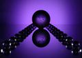
This is a difficult kind of photo for me to critique. Comments that come to mind are, "Interesting", "I wonder how this was done?", and "Cool lighting."

For an in-depth critique I need to be more specific and more honest about my appreciation for the image and my viewing experience. The word that comes to mind when I think hard on this photo is 'relevence'. Unlike an abstract composition which is created by framing an existing subject in an unexpected and unusual way, this is a purely set-up abstraction. The enjoyment factor rests entirely on whether or not the viewer finds it a compelling arrangement of form, line, and color. Put another way, an abstract created by framing a small segment of the side of a weathered exterior (by way of example) has some interesting subject matter built in. The viewer may still not appreciate the composition but his ability to recognize that the abstraction was created from the textures, shapes, and colors of a larger object adds something to the viewing experience. He may not know exactly what the larger object is or indeed, how much larger it is then the section he has been allowed to see but theirin lies some of the enjoyment of an abstraction.

A set-up abstraction (in a photograph--I have different feelings regarding abstract painting) doesn't leave the viewer with any questions other than, "how was this done?" and 'what thought process led to this creation?'. Those questions are interesting in a technical sense but not as inherently sastifying (to this viewer) as the more universal experience created by viewing something familiar shown as a small part of a whole. Keep in mind, I don't mean to imply that this is the only way to create an abstract with existing subject matter. My point is more about the use of a subject that is familiar to create an abstraction. While marbles are a familiar object, these have been clearly arranged to create a design. The approach has not been to find the design existing already within the marbles but to arrange them in such a way as to create a completely new design, unfamiliar to the viewer.

This may seem like a lengthy explanation but I have a point. With the photo presented here, one either likes the design, doesn't like it, or is indifferent. Being a work of pure abstraction and imagination, there isn't much else to think about. It doesn't spark a sense of familiarity or meaning to the viewer. I have to admit to falling into the 'indifferent' category. I enjoy the color but I'm just not moved enough by the design elements to have more than a passing interest in the photo. It seems a bit busy to me. I like the look of the main sphere. I think I would have enjoyed this quite a bit if was just a single glass sphere suspended in the ambient purple background. The image does not support the title. I don't experience a sense of infinity from viewing this as there is clearly a beginning and an end. One could argue that a sphere represents infinity, in which case, this would support my feeling that it should just be one sphere in the composition.

So much for the asthetic experience. On a technical level, the lighting works well and seems to be what you were aiming for. The sphere of lavender light echoes the spheres of the marbles. I would suggest a seamless background to remove the line that bisects the frame.

Message edited by author 2004-07-17 18:34:39.
Pages:   ... [311] [312] [313] [314] [315] [316] [317] ... [364]
Showing 3131 - 3140 of ~3637


Home - Challenges - Community - League - Photos - Cameras - Lenses - Learn - Help - Terms of Use - Privacy - Top ^
DPChallenge, and website content and design, Copyright © 2001-2025 Challenging Technologies, LLC.
All digital photo copyrights belong to the photographers and may not be used without permission.
Current Server Time: 06/20/2025 08:22:03 PM EDT.