| Image |
Comment |
| 05/10/2005 07:37:07 PM |
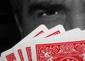
5 Card Studby TommyMoe21Comment by Art Roflmao: Nicely done. Not hugely attractive like for a wall hanging, but one of the more interesting shots in this challenge. Could be an ad for the World Poker Tournament with white text in the upper left corner. |
 Photographer found comment helpful. Photographer found comment helpful. |
| 05/10/2005 04:22:14 AM |
|
| Photographer found comment helpful. |
| 05/09/2005 02:53:39 AM |
|
| Photographer found comment helpful. |
| 05/07/2005 04:40:41 PM |
|
| Photographer found comment helpful. |
| 05/07/2005 05:05:44 AM |
|
| Photographer found comment helpful. |
| 05/07/2005 03:09:13 AM |
5 Card Studby TommyMoe21Comment by Sammie: I always thought you had the cards on the table when you played Stud Poker. This looks like draw poker. The cards are nice and sharp. |
| Photographer found comment helpful. |
| 05/07/2005 02:38:43 AM |
|
| Photographer found comment helpful. |
| 05/07/2005 01:48:10 AM |
|
| Photographer found comment helpful. |
| 05/04/2005 04:41:52 PM |
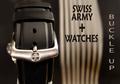
Swiss Army Watchesby TommyMoe21Comment by cpanaioti: *** Critique Club ***
General: The tones are very pleasing and focus is on the brightest part of the image which is what draws the viewers attention.
Composition: The position of the watch itself seems to work however the image as a whole feels out of balance. This could be due to the sections of the image being of different widths and different intensities. It feels weighted a bit too much on the left. Removing the 'Buckle Up' text or changing its location may help. Also, the other text may help balance the image a bit if it were a bit lower in the frame.
Exposure: There are some areas of overexposure, on the buckle and in the background. However these areas are not large enough to present too much of a distraction. Changing the angle of view may have helped here.
Impact: Some impact is created by the tones used and the sharp focus. However, the misplacement of the text takes away from the impact of the other elements.
Keep shooting.
Colette |
| Photographer found comment helpful. |
| 05/01/2005 10:28:56 PM |
Swiss Army Watchesby TommyMoe21Comment by Brad: One of a kind in this challenge.
The overall non-dead center composition is good, though the text is taking away from it inmy opinion. Perhaps not having the "Swiss Army + Watches" in it would have been better, as this shot makes me think belt buckle, as there is no watch visible. (5) |
| Photographer found comment helpful. |
Home -
Challenges -
Community -
League -
Photos -
Cameras -
Lenses -
Learn -
Help -
Terms of Use -
Privacy -
Top ^
DPChallenge, and website content and design, Copyright © 2001-2026 Challenging Technologies, LLC.
All digital photo copyrights belong to the photographers and may not be used without permission.
Current Server Time: 05/07/2026 05:46:11 AM EDT.