| Image |
Comment |
| 09/02/2006 11:30:58 AM |
|
 Photographer found comment helpful. Photographer found comment helpful. |
| 09/01/2006 11:54:48 PM |
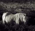
Lostby cheekymunkyComment by Brad: Great choice for a black & white and good use of shadows to bring out depth.
The subtle details in the shadows work well here. |
| Photographer found comment helpful. |
| 09/01/2006 08:02:06 PM |
Lostby cheekymunkyComment by Azrifel: It loos famished and the tone adds a cool (as opposed to warm) deathly tone to it. That horse doesn't look healthy. Is that why he's 'Lost'? |
| Photographer found comment helpful. |
| 09/01/2006 03:55:54 PM |
Lostby cheekymunkyComment by bucket: I love how3 you have used the available light..this is a top quality shot...shadows/light mix is beautiful...great work! |
| Photographer found comment helpful. |
| 09/01/2006 02:35:31 PM |
|
| Photographer found comment helpful. |
| 09/01/2006 12:31:29 PM |
|
| Photographer found comment helpful. |
| 09/01/2006 06:15:28 AM |
Lostby cheekymunkyComment by JacquiD: I think I would prefer less space above the horse and more contrast so that we can see the left side of the head more easily. Lovely though. |
| Photographer found comment helpful. |
| 07/14/2006 05:39:38 PM |
|
| Photographer found comment helpful. |
| 06/27/2006 07:46:50 PM |
|
| Photographer found comment helpful. |
| 06/26/2006 06:24:53 AM |
|
| Photographer found comment helpful. |
Home -
Challenges -
Community -
League -
Photos -
Cameras -
Lenses -
Learn -
Help -
Terms of Use -
Privacy -
Top ^
DPChallenge, and website content and design, Copyright © 2001-2026 Challenging Technologies, LLC.
All digital photo copyrights belong to the photographers and may not be used without permission.
Current Server Time: 07/18/2026 12:41:40 AM EDT.