| Image |
Comment |
| 04/27/2012 02:06:11 AM |
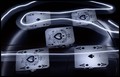
Chocolate Heavenby RyanWComment by jomari: I gave you 5 for this, but I think I hovered between 4 and 5 before clicking. I quite like the limited range of colour but the main aspect that failed to grab me was the composition. You could have had all that chocolate, but more compactly and artistically arranged. It is just too spread out and scattered. I agree with others that the vignette did not help. |
 Photographer found comment helpful. Photographer found comment helpful. |
| 04/26/2012 06:43:24 PM |
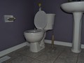
Company's coming NOW???by RyanWComment by SEG: This is just a ho hum snapshot. Better lighting and something else to punch it up would help. Maybe someone on the throne? |
| Photographer found comment helpful. |
| 04/26/2012 10:39:00 AM |
|
| Photographer found comment helpful. |
| 04/25/2012 12:55:43 AM |
|
| Photographer found comment helpful. |
| 04/24/2012 08:22:45 AM |
|
| Photographer found comment helpful. |
| 04/23/2012 04:39:21 PM |
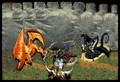
Electric Deathby RyanWComment by Teafran: I like these kind of imaginative takes on challenges. Pretty clever. One complaint is what I assume is the glue holing the cards in place. The eye goes to that immediately and it distracts from the overall impact of the image. |
| Photographer found comment helpful. |
| 04/23/2012 11:44:09 AM |
Chocolate Heavenby RyanWComment by tanguera: Mostly, the tones and colors are quite monotonous, and the composition is too cluttered. Perhaps half as many objects, but more varied (dark/milk/white chocolate...?) and for sure a different surface/bg. The white vignette further dilutes the already flat tones. I think this could also have worked as a macro. |
| Photographer found comment helpful. |
| 04/23/2012 11:43:09 AM |
Chocolate Heavenby RyanWComment by bassbone: I saw your post in the threads on this image. While I like the concept of the shot, there are several things about the image that really go against a good score. First, the image does not have good control of focus. The front edge of the crunchy candy bar in the right center is not in focus and this gives the impression the entire image is out of focus. Second, the choice of white vingette does not work as it has hard edges and is actually drawing our eyes away from the subject. Third, the image is cluttered with too much stuff. I understand that you want to speak to how chocolate is your 'drug' but the cocoa powder just looks messy and the composition with so many objects looks messy. Fourth, the line in the top third of the image seems to cut the scene in two (angling the shot more to have only the table as the background may have helped you. But to be honest, the choice of wood grain as the background gives this even more of a feeling of 'snapshot'.
I didn't vote, but had I, I would likely have given it no more than 4 because of the topics above.
For these type shots - staged 'studio' work - the image has to be perfectly lit, perfectly composed, and perfectly processed just to get you to 6. |
| Photographer found comment helpful. |
| 04/23/2012 11:21:29 AM |
Chocolate Heavenby RyanWComment by klkitchens: I did not vote in this one (during my break from the site). However, the white vignette does not work for me and draws me out of the photo. In addtion, there appears to be too much going on that does not add anything to the photo (here's some chocolate, oh look what's that, oh more choclate and over there is some more chocolate...). A close up of one piece of chocolate dropping into melted chocolate (ala a commercial) might have had more impact. |
| Photographer found comment helpful. |
| 04/22/2012 10:14:36 AM |
|
| Photographer found comment helpful. |
Home -
Challenges -
Community -
League -
Photos -
Cameras -
Lenses -
Learn -
Help -
Terms of Use -
Privacy -
Top ^
DPChallenge, and website content and design, Copyright © 2001-2026 Challenging Technologies, LLC.
All digital photo copyrights belong to the photographers and may not be used without permission.
Current Server Time: 06/21/2026 05:10:28 PM EDT.