| Image |
Comment |
| 02/10/2003 12:28:17 AM |
|
 Photographer found comment helpful. Photographer found comment helpful. |
| 02/02/2003 10:58:24 PM |
|
| 02/02/2003 05:24:08 PM |
|
| 02/02/2003 01:09:37 PM |
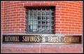
Tighter Than A ...by albright1Comment by lisae: Seems a little slanted. I like the framing of this though. The bars on the window are great, and the curve of that wall has a cool effect on the composition. The bricks are a lovely red. |
| 02/02/2003 08:33:47 AM |
Tighter Than A ...by albright1Comment by kevinswope: The lower right corner seems to be washed out a little from the light and where the sighn meets the brick is crooced just a little. I wish there were somthing more to draw my attention. |
| 02/01/2003 12:22:47 PM |
|
| 01/31/2003 01:09:13 PM |
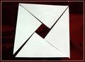
Pythagorean Proofby albright1Comment by keone: Nice concept. The focus and subject of the photo is a negative space. It really draws your attention to the middle. This was one of my favorites. |
| 01/30/2003 05:26:32 PM |
Tighter Than A ...by albright1Comment by jimmyn4: I don't know the saying so I don't understand the title. That has no affect on my voting though. I will say that the glare off the &Trust is quite distracting but other than that a nice photo. |
| 01/30/2003 02:31:19 PM |
|
| 01/30/2003 01:32:22 PM |
Tighter Than A ...by albright1Comment by LindaLee: An interesting shot with the repetition of pattern in both the bricks and the ironwork over the window. Pretty good lighting, and the composition isn't bad, though the photo does look a little crooked. |
Home -
Challenges -
Community -
League -
Photos -
Cameras -
Lenses -
Learn -
Help -
Terms of Use -
Privacy -
Top ^
DPChallenge, and website content and design, Copyright © 2001-2026 Challenging Technologies, LLC.
All digital photo copyrights belong to the photographers and may not be used without permission.
Current Server Time: 07/16/2026 12:24:25 AM EDT.