| Image |
Comment |
| 05/30/2007 10:00:42 AM |
hippy-van.jpgby digitalpinsComment by RainMotorsports: You had to throw me for a loop on this one. Not your usual style.
Im not so sure I would jump to call it a Hippy Van. Then again someone older then me can probly tell me th oriign of cool beans. I just know I first heard it in high school. As far as the owner I would pin it on a College kid who got it as a freebie from their parents. The van was probly in dire need of a paint job and the kid let the art students have at it. I see it all the time at my college.
I imagine it was bright enough to not use flash. If so it seems as if the camera flashed You can see it in the reflectors, I would have turned it off if possible. |
| 05/30/2007 09:48:56 AM |
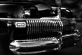
1948 Chevrolet Fleetlineby digitalpinsComment by RainMotorsports: You have to love this one too. The sky relfections are beatiful on the curved surface of the car. I do hate some of the lower reflectons but once again at a car show you really cant have a person with a sheet following you around.
Also with a car show you cant really turn the wheels. It works fine for this photo you and you seem to have a love for this tight crop. I myself have trouble deciding what to crop. If shooting the image for a friend I would have them turn the wheels to meet the lens face. But to too much to cover the white walls. |
| 05/30/2007 09:45:51 AM |
De Sotoby digitalpinsComment by RainMotorsports: The car itself is a work of art. The headlamp covers give it a personality. The plate is classic so leavng it in is a good choice. It could be easily removed due to the lack of light surrounding it.
As for the relections they seem to provide the main soruce of illumination. Alot of car photographers will use sheets in a particular color (any would work on this) Primarilly black to create an artifical horizon. This would actually have hurt the photo and its not something people do when just shooting cars. I only say it would be good in the fact the reflection of a wide open space kind of takes away fromt he close crop feeling. But the lighting it provides makes it best to not block out any incoming light.
I love it and have actually see it before in your portfolio i believe. |
| 05/27/2007 07:35:00 PM |
USA Flagby digitalpinsComment by Haneck: Neat! I might suggest rotating it a little, so it's not crooked, but otherwise this is a nice shot. |
| 05/26/2007 01:21:00 AM |
|
| 05/24/2007 09:09:56 PM |
|
| 05/24/2007 03:54:36 PM |
USA Flagby digitalpinsComment by cogerox: Very powerful. Maybe it was on purpose, but you weren't square to the building when you took the shot. |
| 05/24/2007 02:16:55 PM |
USA Flagby digitalpinsComment by glad2badad: Ok. This works. :) Given that this challenge is running under the 'Advanced' ruleset I'd have attempted some burning across the top and top corners. It's a little bright up there in comparison to the rest of the image and is a bit distracting. JMO of course. Good luck in the challenge.
BTW - Commenting only, not voting. |
| 05/23/2007 08:32:03 AM |
USA Flagby digitalpinsComment by rahim: The shot looks like it was taken from a strange angle - it looks untidy that the steps aren't parallel to the bottom of the frame. |
| 05/22/2007 11:32:02 AM |
|
Home -
Challenges -
Community -
League -
Photos -
Cameras -
Lenses -
Learn -
Help -
Terms of Use -
Privacy -
Top ^
DPChallenge, and website content and design, Copyright © 2001-2026 Challenging Technologies, LLC.
All digital photo copyrights belong to the photographers and may not be used without permission.
Current Server Time: 07/16/2026 01:44:22 PM EDT.