| Image |
Comment |
| 05/07/2002 11:35:00 PM |
|
| 05/07/2002 06:16:00 PM |
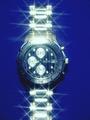
Piere Cardinby doogbullComment by Sonifo: I like the way the light sparkles, but I think it might be a bit much. I would have liked to see the name on the watch and not the title. |
| 05/07/2002 05:38:00 PM |
Piere Cardinby doogbullComment by pnicholls: Nice work, but think I would have tried to minimize the bright flash reflection at the 12 o' clock position. The rest of them make it look luxurious. |
| 05/07/2002 04:51:00 PM |
|
| 05/07/2002 04:20:00 PM |
|
| 05/07/2002 12:51:00 PM |
|
| 05/07/2002 10:31:00 AM |
|
| 05/07/2002 08:24:00 AM |
|
| 05/07/2002 03:16:00 AM |
Piere Cardinby doogbullComment by lisae: It's too sparkly... kinda like an early 80s advertisement. I don't think the blue background sets off the watch very well, it makes the silver seem harder and cold. |
| 05/06/2002 10:57:00 PM |
|
Home -
Challenges -
Community -
League -
Photos -
Cameras -
Lenses -
Learn -
Help -
Terms of Use -
Privacy -
Top ^
DPChallenge, and website content and design, Copyright © 2001-2026 Challenging Technologies, LLC.
All digital photo copyrights belong to the photographers and may not be used without permission.
Current Server Time: 07/16/2026 12:20:55 AM EDT.