| Image |
Comment |
| 07/20/2005 05:39:03 PM |
|
 Photographer found comment helpful. Photographer found comment helpful. |
| 07/20/2005 01:16:21 PM |
|
| Photographer found comment helpful. |
| 07/20/2005 10:03:33 AM |
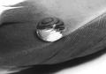
*****by xcharrierComment by Jutilda: Effective macro. I might play with the contrast a touch more to bring up the darker tones. Nicely done. 7 |
| Photographer found comment helpful. |
| 07/14/2005 10:37:20 AM |
4-Teenby xcharrierComment by AlexMonty: This is absolutely incredible, glad this finished so well but would have liked to see it finish a little higher. Unfortunately I missed this in the voting but it would have been a definite 8 or 9 from me.
Congrats on a fantastic capture. |
| Photographer found comment helpful. |
| 07/13/2005 06:21:02 PM |
Untitled-136.jpgby xcharrierComment by hankk: Originally posted by hbunch7187:
The other thing that I notice that seems odd is the way her legs have a greenish tint and her arms have a red tint. Neither of which look natural. |
You've done a great job with this series!
I had a similar problem and realized that it was from mixed light sources. Flourescent lights will give a green cast, while the flash will probably look too magenta or red. Try using a CTG filter over your flash so you match the flourescent lights, or turn the flourescent lights off entirely. |
| Photographer found comment helpful. |
| 07/13/2005 01:15:18 PM |
Untitled-130.jpgby xcharrierComment by HBunch: Love the light in the hair. I think you captured that very well. This one has the same skin coloration as the other shot with similar pose. I love the eyes in this shot. Very nice color. Good pose, but has the unflattering elbow wrinkles. The line inthe background goes directly into her eye. This background doesn't see to work for me I don't think. I like the white of it, and the color works nicely with her skin, but that darned horizontal line. lol Message edited by author 2005-07-13 13:15:45. |
| Photographer found comment helpful. |
| 07/13/2005 01:08:46 PM |
Untitled-8.jpgby xcharrierComment by HBunch: I like the crop on her back much better here. Gives some 'room to breathe', and I think it helps to show the light coming through her hair. Bit of a tight crop in the leg though. The way her top is wrinkled up around her waist a bit makes her seem 'thicker' in the waist than she really is. Nothing wrong with that at all...but if I had a body like that, I would want it to show to the best of it's ability and not 'hide' behind something that isn't very flattering. Flatten it out and I think it would be just fine. See where I'm talking about? Under her left arm on her right side. It's bunched up there. The earring against that background again stands out and since we can't really see the earring on this side, just kind of looks like something stuck to her face. |
| Photographer found comment helpful. |
| 07/13/2005 01:03:37 PM |
Untitled-5.jpgby xcharrierComment by HBunch: Love the lighting in her hair. Wish her back wasn't chopped off. Nice pose and look on her face is nice as well, but dark eyes. The earring(?) hanging from the right side of her head near her mouth is bright and a bit of a distraction. Shows up real bright on the darker background. I do like the background here a lot. I think that since the light coming through her hair looks so pretty, that having it cropped so close to her back is a bit of a dissapointment. otherwise, I like this shot a lot. |
| Photographer found comment helpful. |
| 07/13/2005 01:00:17 PM |
Untitled-107.jpgby xcharrierComment by HBunch: Her eyes seem dark in this shot. I like the pose, I like the look on her face, all seems good except the dark eyes. I saw how beautiful the eyes were in the other pics and wish we could see them here. |
| Photographer found comment helpful. |
| 07/13/2005 12:58:09 PM |
Untitled-164.jpgby xcharrierComment by HBunch: Her skin tones seem much more natural in this shot. Much more even. I'm not sure about the pose though. The look on her face seemsodd and the angle at which you took the photo is putting emphasis on her behind. You know how when something is closer to the camera it appears larger? Her bottom half looks unproportioned to the upper half. I know she's NOT, cause I saw the other pics. Also, the horizintal line in the background here is chopping her head off. Again, just observations. |
| Photographer found comment helpful. |
Home -
Challenges -
Community -
League -
Photos -
Cameras -
Lenses -
Learn -
Help -
Terms of Use -
Privacy -
Top ^
DPChallenge, and website content and design, Copyright © 2001-2026 Challenging Technologies, LLC.
All digital photo copyrights belong to the photographers and may not be used without permission.
Current Server Time: 07/17/2026 11:53:01 PM EDT.