| Image |
Comment |
| 11/26/2003 12:23:07 AM |
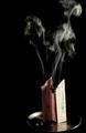
Papier d'Arménieby sergutComment by justine: My junior high French is very poor...but I did look up to see what this was...Paper d?Arménie is oldest cleansing natural and deodorizer to l?air ambient. It purifies and scents to l?air houses, it removes the bad smells: tobacco, cracklings? You will like its delicate odor and its great capacity to purify to l?air will satisfy you.
Now I know. Very interesting. Not sure if we have something like this in the USA. Hum, see I learned something, and to top it all off I enjoyed your photo. Very nice, good luck in the challenge. |
 Photographer found comment helpful. Photographer found comment helpful. |
| 11/23/2003 03:28:44 PM |
|
| Photographer found comment helpful. |
| 11/22/2003 03:48:09 PM |
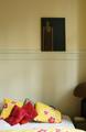
Unbearable lightness of beingby sergutComment by dr rick: Greetings from the Critique Club:
I haven't read the book so can't comment on how well this image reflects its ambiance. The painting is dark and somber, with the subject distorted and squeezed to one side. It is displayed in a light and cheerful bedroom. The combination gives me the feeling of someone who seems happy and balanced but harbors some hidden insecurity or depression. There are two centers of interest, the painting and the pillows. This is normally undesirable, but here it reinforces the dichotomy of happy outside and melancholy inside.
The natural lighting from the windows is perfect; it makes the wall more interesting but doesn't seem to touch the painting. The vertical format matches the painting and is the right artistic choice. Color was the best choice as well; the yellow adds to cheerfulness of the room.
Since you requested a critique, let me point out some weak points. The photo is somewhat blurry; I think sharp focus would have worked better. There is quite a bit of digital noise throughout the photo; it is fine on the painting but somewhat distracting everywhere else. And although the image says plenty to those who make the effort to look, it lacks some element to reach out and grab the viewer's attention. It's message is whispered, not shouted. This isn't necessarily bad, but will probably destine this image to obscurity. |
| Photographer found comment helpful. |
| 11/21/2003 12:48:32 AM |
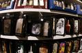
It's Not Because It's Printed It Is Trueby sergutComment by ChrisW123: You pic Title is a little "awkward". Try: "Printed Words Aren't Always The Truth". You image doesn't really have a main subject... You should have concentrated the shot more on one subject that stood out to you. |
| Photographer found comment helpful. |
| 11/21/2003 12:47:53 AM |
|
| Photographer found comment helpful. |
| 11/20/2003 11:22:11 PM |
|
| Photographer found comment helpful. |
| 11/19/2003 03:14:40 PM |
It's Not Because It's Printed It Is Trueby sergutComment by Rooster: hmmm.... this is interesting but I don't get it. I don't unerstand the title making it harder to get the message from the picture. I like the Che one. Are these cardss, lighters, or both? It's hard to tell. Plus the sctoch tape on some of the items kinda takes away from the shot.
|
| Photographer found comment helpful. |
| 11/19/2003 10:57:35 AM |
|
| Photographer found comment helpful. |
| 11/18/2003 05:26:05 PM |
Unbearable lightness of beingby sergutComment by Rooster: The shot itself is great, the composition the lighting & all that jazz. Not sure that it fits the title as this seems to be a pretty nice place to be. JMO |
| Photographer found comment helpful. |
| 11/17/2003 11:56:34 PM |
Back from a walk in the woodsby sergutComment by dr rick: Greetings from the Critique Club!
I really like this image. It has an inviting, warm, peaceful feeling. Your comment implies you wanted to portray coziness and you were successful. You've chosen quite a few compatible yet contrasting elements and arranged them very nicely, with multiple levels to add interest and realism. Good lighting, focus, and processing. The mildly low key tonality works very well.
Although a great photo, since you requested a critique I feel obligated to point out the few flaws. It seems tilted slightly clockwise (or perhaps the painting is just not straight; it has a lot of horizontal and vertical lines that aren't quite). There is some glare from the light on the right side of the painting. The linen has some distracting folds (a bit too realistic!). |
| Photographer found comment helpful. |
Home -
Challenges -
Community -
League -
Photos -
Cameras -
Lenses -
Learn -
Help -
Terms of Use -
Privacy -
Top ^
DPChallenge, and website content and design, Copyright © 2001-2026 Challenging Technologies, LLC.
All digital photo copyrights belong to the photographers and may not be used without permission.
Current Server Time: 07/17/2026 11:08:09 AM EDT.