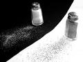
Salt 'n' Pepperby
goinskiingComment by JC_Homola: Greetings from the critique club.
This was my favourite of the salt/pepper shots in the challenge.
I like your placement of the two backgrounds. diagonal but not corner to corner.
I feel that the top crop is a little too close, because the pepper shaker is appearing to be farther away, it gives the illusion that the top is cropped closer than it is. The two main elements in an image like this tend to "feel" better if the negative space is equal, or at least looks like it is.
The shakers are at different angles, possible having them at the same angle or more extreme in the difference it would have been better.
One other thing and this is probably just a personal preference of mine, the salt and pepper are rather messy... I'd like to suggest making it neater. The pepper looks as if it is running over on the salt side and vice/versa.
I hope this helps, and remember, this is just my opinion.
JC