| Image |
Comment |
| 03/15/2004 07:26:40 AM |
The Key's to Successby jefalkComment by Mousie: fantastic lighting and composition, but i wish for more passion. also, "Key's" is making me crazy, it's "Keys" unless you're making some sort of deliberate play on words involving a key that I don't get. |
 Photographer found comment helpful. Photographer found comment helpful. |
| 03/15/2004 01:53:15 AM |
The Key's to Successby jefalkComment by boomer: Beautiful shot. A wall hanger for sure. Bit of a white hot spot near the keys, and the background behind the model isn't my taste, but might just be me. Really well done photograph... |
| Photographer found comment helpful. |
| 03/15/2004 01:26:24 AM |
|
| Photographer found comment helpful. |
| 03/15/2004 01:12:55 AM |
|
| Photographer found comment helpful. |
| 03/15/2004 01:12:11 AM |
|
| Photographer found comment helpful. |
| 03/15/2004 12:40:41 AM |
The Key's to Successby jefalkComment by Gringo: This is my favorite portrait of the challenge so far. This is perfect work. The subject is more than just a face. This tells the story of the person. Nice simple color with formal black drops that help keep your attention on the subject. The only thing this needs is your signature :) Beautiful work! 10 |
| Photographer found comment helpful. |
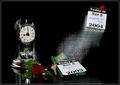
| 11/19/2003 12:24:22 AM |
"Same Time, Next Year" - a romantic comedyby jefalkComment by jefalk: I had tossed it back and forth on what exactly to put or keep in the photo trying to hold the intended attention/focus intact, but with the shot already taking just over 7/hrs, this was the result and I had too stop trying. However, in the books' story (or the movie with Alan Alda), the anniversary clock along with the rose in my opinion strengthened the symbolic romance through their annual 25 year affair. I did like the fact that the clocks pendulum also showed a nice motion effect in the shot as well. Of course this is always so subjective.
Photographically, the shot was f25-5/sec as a summation of 45/flashes; a main burst of (4) studio heads totaling 1200ws with some softboxes and reflectors, and then 40 hits of my Canon 550EX at 1/128 and 8hz creating the motion effect. The date/year changing mid-flight was because I printed a second set of date slips and glued them back to back and opposite top to bottom on a coat hanger painted flat-black. The initial position of the coat-hangered slips was just behind and below the upper 2004, and right after the main burst which started the strobes, I swooped it down and flipped it front to back mid-flight changing the face to 2003 as it settled at the bottom of the shot.
I was determined to tell the story of the title with a hint of the plot as well in a single exposure; and try and pull off a very technically challenging shot (for me anyway)... I was pleased with the fact that I had sketched a story-board for this shot with detail, and it turned out just about exactly as I had planned right down to the subtle details in the rose. A bunch of work, but tons of fun too!
Thank you all again for all the nice comments,
John
|
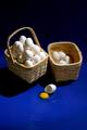
| 11/17/2003 11:02:00 PM |
Don't Put All Your Eggs in One Basketby jefalkComment by KevinRiggs: Composition:
This composition shows that you have talent for both coloring and lighting. The vertical crop adds some definition to what you present the viewer. You've provided a continuous gradiation from the blue at the bottom to the black at the top on the righthand side while on the lefthand side you cropped into the solid shadow of a basket. The angle you chose allows you to show the viewer both the basket with many eggs and the contents of the less full basket which gives good object contrast. I like the broken egg as a visual cue to reinforce the "grain of truth" inherent in this saying. You chose and setup your physical elements well for your interpretation. I would also be interested to see what kind of impact you might create if you chose to zoom & crop with only part of the overfull basket and the broken egg. In my thinking that would be a more traditional shot, though, and I think you have created a unique composition with your choice of a vertical presentation.
Color:
My initial feeling is that one of the more important color elements of this photo is the yellow of the yolk on the blue background. It immediately presents a contrasting color for both the blue and white (perhaps complimentary for the blue; I just don't have my color wheel handy right now). The natural coloration of the baskets help to reinforce the organic curves of the eggs. Good use of 4 or 5 basic colors to present an idea on a couple of levels.
Lighting:
Now here's another area where you stepped out a little from what I might expect. The lighting is almost too harsh with hotspots on some eggs in the overloaded basket. The shadows are also strongly defined and yet the don't seem to add any particular nuance to the presentation beyond another "color". The shadows produced don't seem to present any special texture to your composition. I do like the catchlight within both the yolk and the albumen as well as the less harsh shadow within the broken egg shell. I would be interested in seeing this same photo with a scrim or some diffuser cutting the glare a little on the subjects.
Focus:
Pretty good focus. I don't know if you USM'd this shot or not. It looks like it has a decent focus but because of the amount of space you put into the top and bottom and because the photo is cut down for this competition you weren't able to present very close looks at any edges. I have no doubt that you have sharp focus in your original and that some of that sharpness might have gotten lost in the translation to DPC's resolution.
Overall:
This is a good approach to still life and you selected good subjects to work with. You created a good color scheme and you definitely have your take on the lighting. I think the lighting and the cropping make this a unique presentation and it is that different look at this common adage that makes your photo a fun presentation to look through and a challenging to view for others to apply to their own creations. |
| Photographer found comment helpful. |
| 11/17/2003 09:34:14 PM |
|
| Photographer found comment helpful. |
| 11/17/2003 09:54:03 AM |
|
| Photographer found comment helpful. |
Home -
Challenges -
Community -
League -
Photos -
Cameras -
Lenses -
Learn -
Help -
Terms of Use -
Privacy -
Top ^
DPChallenge, and website content and design, Copyright © 2001-2026 Challenging Technologies, LLC.
All digital photo copyrights belong to the photographers and may not be used without permission.
Current Server Time: 07/16/2026 05:15:32 AM EDT.