| Image |
Comment |
| 12/11/2003 08:36:56 AM |
|
| 12/10/2003 05:50:28 PM |
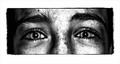
Megans eyesby laheffComment by Rooster: Whoa! Love the border style but kinda too thick. What a look! Seems really desparate & scared almost. Love that it is BW. Very interesting! |
| 12/10/2003 05:03:33 PM |
Megans eyesby laheffComment by drgsoell: Lots of contrast in this shot. Maybe a bit too much? Simplicity of expression holds true here. I like the cropping and focus of this picture. |
| 12/10/2003 03:23:58 PM |
|
| 12/10/2003 01:31:26 PM |
|
| 12/10/2003 10:07:44 AM |
Megans eyesby laheffComment by irae: Her face has a lot going on for 'simple', but what a great B/W conversion! I like your border treatment, as well. It could be my cr@p monitor here at work, but her eyes look slightly soft. |
| 12/10/2003 08:32:19 AM |
Megans eyesby laheffComment by amsmyth: The image seems over processed and the freckles (?) are too prominent in the lighting... |
| 11/17/2003 04:10:19 PM |
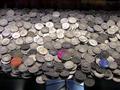
Coinsby laheffComment by joannadiva: Greetings from the critique club:
First off your image is too small I can't tell what I'm really looking at the I'm aware it's a tray full of coins but coins themselves are rather fuzzy. They appear to be dimes i can't tell fro sure. I see this was taken in scotland so I can assume not. I like the light gradation but I think your image would have more wow impact it was cropped just to contain the coins and the light grad and not the tray. It would look like money into infinity. (a really nice concept don't you think ;)) The little chips thrown in?? were they random and if not it's not clear what their color or position indicates. when I first looked at them all in a row like that I thought they were meant to indicate the 3 ribbons but they're not in the right order or the right colors for that so... Less distracting if they were removed, or placed to look more random.
Good luck and keep shooting
jo
PS they have casinos in scotland? and they let you take pictures? |
| 11/10/2003 06:43:37 PM |
Coinsby laheffComment by jmritz: With a larger view and in focus this could be a good picture. I like the comp. |
| 11/07/2003 09:24:48 PM |
Coinsby laheffComment by Stewan: Very small image...this could have been great had the image been larger and more detailed |
Home -
Challenges -
Community -
League -
Photos -
Cameras -
Lenses -
Learn -
Help -
Terms of Use -
Privacy -
Top ^
DPChallenge, and website content and design, Copyright © 2001-2026 Challenging Technologies, LLC.
All digital photo copyrights belong to the photographers and may not be used without permission.
Current Server Time: 07/15/2026 01:05:10 PM EDT.