| Image |
Comment |
| 08/13/2016 10:22:57 AM |
|
 Photographer found comment helpful. Photographer found comment helpful. |
| 08/12/2016 07:28:47 PM |
|
| Photographer found comment helpful. |
| 06/02/2016 07:32:20 AM |
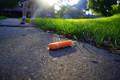
Among Giantsby mrjssimsComment by snaffles: Greetings from the Critique Club!
I like the low POV, and the unusual choice of subject matter adds some interest, but there are a lot of technical problems. The odd combination of fast shutter speed, shallow aperture and high ISO are all completely opposite to the way you need to go when shooting something stationary. Anyway it has cost you in terms of the image grain visible, the bleachy areas of sky on the right and the chromatic aberration (aka purple fringeing in the areas of high contrast on the right). A desat to b/w may have helped because the basic composition is OK, but the bright colours detract from the sombreness of the fact that it's a grave marker. If the title helped explain the relevance of the interred, all the better.
FWIW: you may want to invest in a tripod.
Hope this helps, better luck next time.
Susan |
| Photographer found comment helpful. |
| 04/12/2016 11:20:46 PM |
|
| Photographer found comment helpful. |
| 03/28/2016 01:33:49 PM |
|
| Photographer found comment helpful. |
| 03/14/2016 01:29:46 PM |
|
| Photographer found comment helpful. |
| 03/09/2016 09:22:22 AM |
|
| Photographer found comment helpful. |
| 08/22/2015 08:08:52 AM |
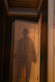
Back from the 40'sby mrjssimsComment by sidpixel: *Hello from Sid and the Critique Club*
A reasonable attempt that meets the challenge well.
You've achieved the desired effect on your subject but he just feels rather static and uninteresting. The lighting is uneven with the right of your 'ghost' much lighter than the left with a clear dividing line just right of centre top to bottom.
I'm not sure if you intended to have a ghost of the door too but the double exposure on the door for me spoils the effect in a way that is detrimental to the end result as a whole. Also spoiling the image is the lean to the right, it would benefit from straightening. A crop excluding all of the right up to the darker doorway would also help. I don't want to appear too negative, your commenters and voters have obviously appreciated it more than I but my suggestions are the things that I would have done to improve it.
Thanks for your submission, Sid |
| Photographer found comment helpful. |
| 08/14/2015 12:04:55 PM |
Fired Upby mrjssimsComment by sidpixel: *Hello from Sid and the Critique Club*
An appealing image that meets the challenge well.
What I like most about your image is the crop it makes the image very appealing and so much more interesting than the bog standard 'chuck it in the middle' approach that is so often seen. However, what lets it down badly is what I suspect to be camera shake. I'm not sure what size your lens was but as you are probably already aware your shutter speed needs to be correspondingly higher as you go further up the telephoto range. There is no sharpness anywhere which has also been exacerbated by your cropping in on it, perhaps at original resolution you may have got away with it, but it is plainly evident here I'm afraid.
It is essential to meet this challenge that you caught the flame in a very obvious sort of way and this you have achieved, well done. The sky is a very vivid blue I think it would benefit from being toned a little, it is quite overpowering as it is.
It's a shame that it wasn't sharper it would have scored higher but thanks for submitting, Sid. |
| Photographer found comment helpful. |
| 08/10/2015 11:00:27 AM |
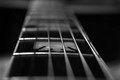
Stairway to Heavenby mrjssimsComment by sidpixel: *Hello from Sid and the Critique Club*
An interesting image that meets the challenge well.
What a novel and original interpretation of the song, I like it. I was thinking its a shame we don't have the first two strings as bright as the others and then I realised we are looking down from the top of the neck and these are the thinner top strings.
I like your wide open aperture and resulting shallow DOF and the chosen focus point, its working very well. I also like the mono conversion. I still keep looking at those top two strings its a shame they're lost by comparison though I doubt there's much you can do about that. Perhaps a slightly smaller aperture may have defined them over the frets more?
In respect of the challenge title the frets translate very nicely into a musical stairway to heaven, I like your thinking, thank you for a great submission, Sid |
| Photographer found comment helpful. |
Home -
Challenges -
Community -
League -
Photos -
Cameras -
Lenses -
Learn -
Help -
Terms of Use -
Privacy -
Top ^
DPChallenge, and website content and design, Copyright © 2001-2026 Challenging Technologies, LLC.
All digital photo copyrights belong to the photographers and may not be used without permission.
Current Server Time: 05/04/2026 04:27:03 PM EDT.