Transcendentby
pambComment by Paul: This is a new comment series for me, so please bear with me while I find my style!
(Voted earlier)
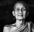
This is one of my 10s - I like it very much. Furthermore I think it enriches the DPC collective portfolio. Put simply, I wish we saw more stuff like this. Let me tell you why it pushes all the right buttons for me:
1. I'm a fan of good portrait work and this is tremendous - a really interesting subject but it is your capture and processing that takes this to another level.
2. Your tones are amazing - how did you get that slightly metallic look? You made me think, and I wonder if it is a curves manipulation....
3. The off-centred composition is genius, most wouldn't have offered this presentation but it really works
4. The background - ensuring that it isn't completely black is a really good call - it adds a degree of naturalness and depth to the image.
5. The symmetry of your subject - he is absolutely straight-on. It's the little things like this that make all the difference.
Overall, this is a top-quality portrait by anyone's standard. Although it isn't (quite) my favourite of the challenge, it's still my call for the Blue.