|
|
|
Showing 841 - 850 of ~2446 |
| Image |
Comment |
| 05/09/2005 08:26:19 AM | |  Photographer found comment helpful. Photographer found comment helpful. |
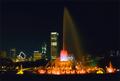
| 05/09/2005 08:14:03 AM | Buck's Placeby flip89Comment by sabphoto: Man I didn't know the fountain was on during this challenge, dang it. I would have gone for this shot too. Probalby wouldn't have done this well though. Good job. |
| 05/09/2005 07:28:36 AM | | | Photographer found comment helpful. |
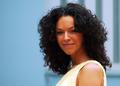
| 05/08/2005 11:05:43 PM | Saucyby flip89Comment by Gatorguy: A lovely model, but I'm not crazy about your choice of crop. To me, the left side of the image has nothing to offer... so why leave it in? 6 |
| 05/08/2005 07:08:00 PM | |
| 05/07/2005 08:06:32 PM | |
| 05/07/2005 02:46:38 PM | Buck's Placeby flip89Comment by Peredur: I really like the colors, but the compositon isn't interesting, and the fact that the image is slightly tilted to the left bothers me a little bit when I'm looking at it. The tilting can be easily fixed in post, of course. But I think if I had taken the picture I would have tried to position myself closer (not trying to capture the whole fountain) and get some of the tallest buildings filling up the background. I think that would make the picture more dramatic.
That being said, I should admit that I don't know if the terrain would allow me to do that, since it's so dark and can't really tell what the geography is like, so these are only suggestions. |
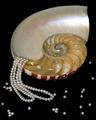
| 05/06/2005 02:02:15 PM | Treasures of the Sulu Seaby flip89Comment by flip89: Heather, thank you so much for your insights. I agree with your comment on the DOF as many viewers do not understand it.
Originally posted by hbunch7187:
*Critique Club*
Definately a good idea, but I'm not so sure it turned out the best it could. In my opinion, a few things could have been different and it might have made the visual impact of the photo a bit higher.
Before I started anything with photography, my first time on DPC, I would see some photos and say to myself '1/2 the pics out of focus'. Then, as I learned the benefits of DOF, it made sense and I began to see photos differently. What I'm trying to say is that I'm not sure if the 'non-photographer' would understand your DOF in this 'ad'. A non photographer might look at this and say '1/2 the pics of out focus'.
I'm not really sure that you benefit anything from having a shallow DOF here. All it does is blurr the back of the shell and the pearls in the front of the photo. I'd like to see it all in focus.
Another thing I notice is that there are little 'pearls' in each chamber of the shell. They don't look like pearls, but they are similar color and size. I find that a bit distracting from the necklace itself.
Lighting appears to be just good, except for a small spot on the upper portion of the shell that is a tad too bright. See how it almost looks whiter than the necklace?
I like the placement of the shell and necklace within the frame of the photo. Having the necklace kind of pour out of the shell is a neat idea. As for being an ad though, there really isn't much space to put your words. That's just a minor thing, but something to think of if you were going for the ad theme.
Overall, a neat idea that just needs some 'cleaning up'.
~Heather~ |
|
| 05/06/2005 01:01:41 PM | Treasures of the Sulu Seaby flip89Comment by HBunch: *Critique Club*
Definately a good idea, but I'm not so sure it turned out the best it could. In my opinion, a few things could have been different and it might have made the visual impact of the photo a bit higher.
Before I started anything with photography, my first time on DPC, I would see some photos and say to myself '1/2 the pics out of focus'. Then, as I learned the benefits of DOF, it made sense and I began to see photos differently. What I'm trying to say is that I'm not sure if the 'non-photographer' would understand your DOF in this 'ad'. A non photographer might look at this and say '1/2 the pics of out focus'.
I'm not really sure that you benefit anything from having a shallow DOF here. All it does is blurr the back of the shell and the pearls in the front of the photo. I'd like to see it all in focus.
Another thing I notice is that there are little 'pearls' in each chamber of the shell. They don't look like pearls, but they are similar color and size. I find that a bit distracting from the necklace itself.
Lighting appears to be just good, except for a small spot on the upper portion of the shell that is a tad too bright. See how it almost looks whiter than the necklace?
I like the placement of the shell and necklace within the frame of the photo. Having the necklace kind of pour out of the shell is a neat idea. As for being an ad though, there really isn't much space to put your words. That's just a minor thing, but something to think of if you were going for the ad theme.
Overall, a neat idea that just needs some 'cleaning up'.
~Heather~ | | Photographer found comment helpful. |
| 05/06/2005 10:26:49 AM | |
|
Showing 841 - 850 of ~2446 |
Home -
Challenges -
Community -
League -
Photos -
Cameras -
Lenses -
Learn -
Help -
Terms of Use -
Privacy -
Top ^
DPChallenge, and website content and design, Copyright © 2001-2026 Challenging Technologies, LLC.
All digital photo copyrights belong to the photographers and may not be used without permission.
Current Server Time: 07/24/2026 08:29:22 PM EDT.
|