| Image |
Comment |
| 01/12/2004 12:22:39 AM |
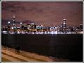
Urban Cosmosby flip89Comment by md8speed: I really like the picture- the two overexposed lights on the right hand side draw a little too much attention to them though |
 Photographer found comment helpful. Photographer found comment helpful. |
| 01/11/2004 07:17:00 PM |
|
| Photographer found comment helpful. |
| 01/11/2004 10:30:43 AM |
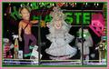
Bachelorette Centralby flip89Comment by Harz_Joerg: Greetings from the Critique Club
Hi Ken, got you again!
Initial thoughts/My opinion
LOL! As tacky as can be! Frontal composition works well here. Great colours, also on the border.
Content/Composition
As others already commented, this is extremely tacky with a good portion of bizarreness. Very well chosen.
I thing you did the composition just right by giving the viewer a full view to the displayed objects, allowing him/her to let the eyes walk around and laugh here and there. There are so many things to look at, focusing on just one item might have not been as good. What I especially like is that the "tree" decoration hangs across the eyes of the "lady".
A strong element in your composition is the border: it looks almost like being the window frame and probably nobody would be surprised if the real window frame would look like that. Therefore it would have been better to crop more at the bottom.
Camera work -technically
Looks fine too me, maybe a tad underexposed (-1/3 EV or so). Focus is just right. Whitebalance too.
Digital Processing - Technical
Sharpening has been well done, it could have been brightened up a little though. As mentioned great job on the border.
Fits the challenge
Yeeeeeeeeees!
Good luck for your further submissions!
|
| Photographer found comment helpful. |
| 01/10/2004 09:42:33 PM |
|
| Photographer found comment helpful. |
| 01/10/2004 07:28:04 PM |
|
| Photographer found comment helpful. |
| 01/09/2004 03:37:50 PM |
|
| Photographer found comment helpful. |
| 01/09/2004 10:03:03 AM |
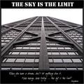
Sky is the Limitby flip89Comment by Harz_Joerg: Greetings from the Critique Club
Initial thoughts/My opinion
Just excellent: full of symmetry and leading lines, with a well-chosen title and subtitle. Very good
Content/Composition
Not much to say that has not already been said: very well composed, B&W is a great choice, good text. As others, I do think that different fonts could fit better to the strong, esthetical lines of the building though.
Also the lower text is hard to read at this size.
Camera work -technically
You did it just right and it shows.
Digital Processing - Technical
Also very well done. The border is well chosen
Fits the challenge
Of course it does.
Taking 14th place in such a strong contest as this was is almost like winning a ribbon in one of the less strong ones, so thumb up and lets wait for your first ribbon.
Good luck for you further submissions
|
| Photographer found comment helpful. |
| 01/08/2004 10:25:17 PM |
|
| Photographer found comment helpful. |
| 01/08/2004 11:54:18 AM |
|
| Photographer found comment helpful. |
| 01/08/2004 01:38:03 AM |
|
| Photographer found comment helpful. |
Home -
Challenges -
Community -
League -
Photos -
Cameras -
Lenses -
Learn -
Help -
Terms of Use -
Privacy -
Top ^
DPChallenge, and website content and design, Copyright © 2001-2026 Challenging Technologies, LLC.
All digital photo copyrights belong to the photographers and may not be used without permission.
Current Server Time: 07/16/2026 02:32:18 PM EDT.