| Image |
Comment |
| 08/02/2004 05:19:25 PM |
|
 Photographer found comment helpful. Photographer found comment helpful. |
| 08/02/2004 03:29:07 PM |
Nautilusby flip89Comment by willem: Since you have cut across the right hand border anyway I would have gone further and cut crop even more to the left and from the top, make it more focussing on the spiral, not on the total shape. |
| Photographer found comment helpful. |
| 08/02/2004 12:55:40 AM |
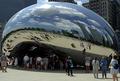
Portal to the Blue Planetby flip89Comment by moodville: It's that sphere again! This does look very futuristic and has its own fisheye effect too. The skyline reflection is good and of course the blue skies and nice fluffy clouds are too. The people make it a little snapshotty but not necessarily in a bad way. The reflection of the people looks neat. |
| Photographer found comment helpful. |
| 08/02/2004 12:22:10 AM |
|
| Photographer found comment helpful. |
| 08/01/2004 02:32:50 PM |
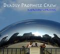
Deadly Prophetz Crewby flip89Comment by wingy: The shot doesn't seem quite "polished" enough for me to picture it on an actual album cover, but it's a great location idea for a shot, and executed pretty well on the whole. I'm not sure if your models were voluntary or candidly captured, but their posing might have been improved. Also a little more depth of field might have helped put them into better focus without giving up the focus on the reflective dome. Anyway, cool concept. Nice work. |
| 08/01/2004 06:39:25 AM |
|
| Photographer found comment helpful. |
| 08/01/2004 01:17:27 AM |
Pepper My Worldby flip89Comment by photom: I really like this! The idea is great as is the composition. I'd like to see the backgroud as a pure white rather than the "fluorescent green" that you have. It would also be fun to play around with moving the colors around - interspacing each row. Good luck! |
| Photographer found comment helpful. |
| 08/01/2004 12:40:08 AM |
Deadly Prophetz Crewby flip89Comment by Olyuzi: Though I think you could have zoomed in a bit more on the band, I love the the backdrop of the urban setting on this chrome globe (?). It really adds realism. Title is a bit of a stretch for me, but won't hurt your score. Overall, I get the impression that this would make a good album cover. Good job! |
| Photographer found comment helpful. |
| 07/31/2004 04:54:03 PM |
Pepper My Worldby flip89Comment by dsa157: great color and I like the arrangement a lot, but I think the lighting is very flat. clever idea that could have been improved with a more dramatic angle and better lighting. |
| Photographer found comment helpful. |
| 07/31/2004 12:59:04 AM |
|
| Photographer found comment helpful. |
Home -
Challenges -
Community -
League -
Photos -
Cameras -
Lenses -
Learn -
Help -
Terms of Use -
Privacy -
Top ^
DPChallenge, and website content and design, Copyright © 2001-2026 Challenging Technologies, LLC.
All digital photo copyrights belong to the photographers and may not be used without permission.
Current Server Time: 07/24/2026 04:58:52 AM EDT.