| Image |
Comment |
| 03/23/2004 09:02:15 PM |
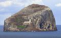
Lighthouse Digestby browntComment by backslash: The porportions don'rt work for a magazine cover. Maybe off centering the rock outcropping and sowing more water would help or a tighter shot of the light house. |
| 03/23/2004 05:21:35 AM |
Lighthouse Digestby browntComment by Zoomdak: Seems like the contrast could have been boosted a little more. I like how it is so isolated. Nice Composition, although I wonder what it would look like in different points (the corners are almost identical)/ nice shot |
 Photographer found comment helpful. Photographer found comment helpful. |
| 03/23/2004 05:14:17 AM |
Lighthouse Digestby browntComment by cbonsall: (I'm writing this to everyone who submitted a landscape shot) The challenge was to produce a shot worthy of a magazine cover but to me a shot like this is not suitable to be put on a "portrait" format magazine.
---ADDITIONAL---
Due to forum discussions and accusations that marking landscapes down is nitpicking, I'm going through them and remarking. I still think some of the landscapes would not make good covers because of their orientation but I am no longer marking down because of that.
I still think landscape is inapropriate for the majority of magazines but I'll give the benefit of the doubt to the photographers. |
| 03/22/2004 11:57:47 PM |
|
| Photographer found comment helpful. |
| 03/22/2004 11:47:05 PM |
Lighthouse Digestby browntComment by ChrisW123: Doesn't look real. What ever you did, was wrong. :) It's tempting to select a certain portion of an image and then go crazy with adjustments, but this a clear example of what NOT to do when fixing your images in PS. |
| 03/22/2004 10:30:46 PM |
|
| Photographer found comment helpful. |
| 03/22/2004 08:16:52 PM |
|
| Photographer found comment helpful. |
| 03/22/2004 07:10:08 PM |
|
| Photographer found comment helpful. |
| 03/22/2004 04:30:32 PM |
|
| Photographer found comment helpful. |
| 03/22/2004 02:40:53 PM |
Lighthouse Digestby browntComment by Trinch: It' s a beautiful subject. The photo itslef looks a bit washed (and I mean I am nitpicking bit, not a noticable bit), likely the result of the distance between you and the island. A little tweeking of the levels may have pulled more out of it. |
| Photographer found comment helpful. |
Home -
Challenges -
Community -
League -
Photos -
Cameras -
Lenses -
Learn -
Help -
Terms of Use -
Privacy -
Top ^
DPChallenge, and website content and design, Copyright © 2001-2026 Challenging Technologies, LLC.
All digital photo copyrights belong to the photographers and may not be used without permission.
Current Server Time: 07/16/2026 06:11:54 PM EDT.