| Image |
Comment |
| 11/12/2003 12:56:42 PM |
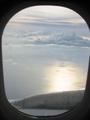
The unbearable lightness of beingby elizutaComment by chamsman: This is an AMAZING PHOTO!!! I love it! I bet you it was taken by a beautiful, sexy little hottie who is extremely talented, has the most beautiful heart anyone could ever imagine, and should be with her boyfriend this second who misses her like crazy. Boker tov my angel. |
| 11/12/2003 03:09:14 AM |
The unbearable lightness of beingby elizutaComment by JPR: I really disliked the book, but I rather enjoy your photo. The title could be the title of the photo, regardless of the book, so you're right on with the challenge rules. Tons of people take photos out of plane windows but nobody ever uses the window as a natural frame. I think it was a great idea that would have been excellent had you managed to get the border even on both sides. Great looking clouds. |
| 11/12/2003 01:18:03 AM |
|
| 11/12/2003 12:50:51 AM |
The unbearable lightness of beingby elizutaComment by LucidLotus: I love the sky and clouds in this image and they really portray the lightness of being in the title. Unfortunately, I think the plane window/parts showing detract greatly, giving it a more grounded feel for me. I think cropping the bottom just above the plane part and adding a medium sized black border to help round out the black surrounds (best if black were even all around) might improve the image and help increase the focus on the clouds/sky which I found to be primary in exhibiting the aforementioned lightness. 4 |
| 10/13/2003 06:54:49 PM |
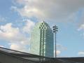
The buildingby elizutaComment by elemess: This is a good idea, but I'm not sure it works. Too much space around the building in my opinion. The bottom is interesting, though. |
| 10/13/2003 06:11:24 PM |
|
| 10/12/2003 05:50:14 PM |
The buildingby elizutaComment by Neuferland: The cropping on this really left me wandering all over the picture. While the building in the center draws you in intially, the light pole to the right distracts you, even though the perspective is awesome, looks like it's the same size, but then the awning across the bottom again draws you away and distracts you. |
| 10/10/2003 05:16:26 PM |
|
| 10/10/2003 03:16:35 PM |
The buildingby elizutaComment by C-Fox: found the light beside it distracts, of course you can't clone in out in a challenge |
| 10/10/2003 03:36:16 AM |
The buildingby elizutaComment by kiwiness: You might have brought in more effect by boosting the contrast because the photo has a kind of flat feeling to it, the colors are kind of washed out in a way. Also trying a different composition so as not to center the building in your image would have benifitted. And the last thing is that the whole image has a definite lean to the right. |
Home -
Challenges -
Community -
League -
Photos -
Cameras -
Lenses -
Learn -
Help -
Terms of Use -
Privacy -
Top ^
DPChallenge, and website content and design, Copyright © 2001-2026 Challenging Technologies, LLC.
All digital photo copyrights belong to the photographers and may not be used without permission.
Current Server Time: 04/01/2026 08:37:26 PM EDT.