| Image |
Comment |
| 05/23/2008 04:32:52 AM |
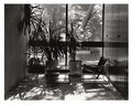
Libraryby RegoComment by rennie: Where are the books? I like the idea. The view through the window is a bit too busy. Shallower depth of field, would've add to the image IMHO. I like the composition and B&W was a good choice. |
| 05/21/2008 09:58:22 PM |
Libraryby RegoComment by SkyeMari: This photgraph would benefit from a awider range of values. It is also not balanced. |
| 05/21/2008 07:47:19 PM |
|
| 05/21/2008 04:20:34 PM |
|
| 05/21/2008 01:22:49 PM |
Libraryby RegoComment by xodiak: There's a nice play of light here but I'm not sure why you chose B&W. Guessing at the colors, I'd have liked to see the green of the plants (both indoors and out) agains the brick floor. |
| 04/01/2008 09:09:39 PM |
Passionby RegoComment by pjangel: I like the facial expressions here... the white is just a little blown out in places. |
| 04/01/2008 06:37:10 PM |
Passionby RegoComment by MG: The highlight on the right is a bit distracting to my taste. |
| 03/31/2008 12:33:49 PM |
|
| 03/29/2008 09:36:53 PM |
Passionby RegoComment by jjstager2: This is a great shot for this challenge. The only thing that takes away from the effectiveness of this shot is the highlights on the right that appear to be starting to erase the models from the right. What was this - a sheet? |
| 03/29/2008 08:23:18 PM |
Passionby RegoComment by jschro: Like the composition, however, the blown highlights are distracting. |
Home -
Challenges -
Community -
League -
Photos -
Cameras -
Lenses -
Learn -
Help -
Terms of Use -
Privacy -
Top ^
DPChallenge, and website content and design, Copyright © 2001-2026 Challenging Technologies, LLC.
All digital photo copyrights belong to the photographers and may not be used without permission.
Current Server Time: 07/16/2026 02:12:40 AM EDT.