| Image |
Comment |
| 04/21/2004 11:34:48 PM |
|
| 04/21/2004 09:07:15 PM |
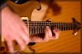
amazing new chord progresssion discoveredby wickedpeteComment by nfessel: This image relies entirely on the title. The challenge is to find something/someone/etc. that you didn't expect to find. Find the serendipity in the actual subject, don't make the subject surrendipitous by adding a 'discovery' title. |
| 04/21/2004 03:52:09 PM |
|
| 04/21/2004 09:29:23 AM |
|
| 04/21/2004 12:15:25 AM |
|
| 04/17/2004 09:11:31 AM |
|
| 04/16/2004 12:17:18 PM |
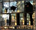
Fixer Upperby wickedpeteComment by moodville: I like the background panes with what seems like different colored glass and the way the light hits them different. The overall feeling I get from this is somewhat chaotic with no singular focal point. From bricks to reflections to background glass to what is beyond those. There is also something about the bricks that do not seem quite right, I dont know if it's the coloration or too much yellow hue shift or what. I dont dislike it, and it's not a bad shot, I'm just left feeling... confused, I guess. |
| 04/15/2004 08:53:07 AM |
Fixer Upperby wickedpeteComment by BobsterLobster: Some interesting elements here, but the overall effect is a bit chaotic. The burnt out highlights don't work too well. I like the colours and textures. I'd have straightened everything in PS using 'distort' so all the lines are parallel to the edge of the picture. |
| 04/15/2004 07:50:38 AM |
Fixer Upperby wickedpeteComment by soccerdad: I gave this a 7, and would have scored it higher if the detail on the bricks wasn't out of range. The lighting and colors here are simply excellent. |
| 04/14/2004 06:02:02 PM |
|
Home -
Challenges -
Community -
League -
Photos -
Cameras -
Lenses -
Learn -
Help -
Terms of Use -
Privacy -
Top ^
DPChallenge, and website content and design, Copyright © 2001-2026 Challenging Technologies, LLC.
All digital photo copyrights belong to the photographers and may not be used without permission.
Current Server Time: 07/16/2026 07:37:46 PM EDT.