| Image |
Comment |
| 03/24/2005 07:40:30 PM |
|
 Photographer found comment helpful. Photographer found comment helpful. |
| 03/24/2005 01:46:50 PM |
Naggedby michael_pComment by charmayne: Cool shot and I love the setting although its a bit crooked which could easily be fixed with a straighten tool |
| Photographer found comment helpful. |
| 03/23/2005 06:15:23 PM |
|
| 03/23/2005 03:20:14 PM |
Tramtalisingby michael_pComment by 2Shay: I don't realy care for the color tone on this photo. It has too much of an orange cast for sepiatone effect. Background distracts from overall photo. |
| 03/23/2005 12:38:08 AM |
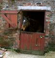
Naggedby michael_pComment by tasha4paws: which is older the stable or the horse. get it some specs. an fix the door u lazy soab. This is an old old nag.
Time to feed the dogs eh!
Nice image |
| 03/22/2005 08:03:48 PM |
|
| 03/21/2005 11:36:40 PM |
|
| 03/21/2005 02:38:09 PM |
Tramtalisingby michael_pComment by Montereykiddo: This is not a great example of a stock photo. Stock photography needs to be something marketable that an ad ageny might pick up. I don't see this as being the least bit versitile....What I mean is that if you had taken a sharp crystal clear image of the wheels of the train, it could be used in many types of ads...."Keep on moving" "rolling"....the psycological message would be there.
Also not a fan of the color scheme you decided to use....you probably tried to warm the picture up but it turned out a bit mucky. The red bleeds into the sky....maybe black and white would have been more appropriate.
Not trying to rip on you....just give you some feedback because I hate when people don't take the time to comment on images that will probably finish middle of the road.....then it leaves those people wondering what they could have done to improve their score. Take my opinion with a grain of salt....I'm just one photographer. |
| Photographer found comment helpful. |
| 03/21/2005 05:23:31 AM |
|
| Photographer found comment helpful. |
| 03/20/2005 07:23:48 PM |
|
| Photographer found comment helpful. |
Home -
Challenges -
Community -
League -
Photos -
Cameras -
Lenses -
Learn -
Help -
Terms of Use -
Privacy -
Top ^
DPChallenge, and website content and design, Copyright © 2001-2026 Challenging Technologies, LLC.
All digital photo copyrights belong to the photographers and may not be used without permission.
Current Server Time: 07/18/2026 11:14:06 AM EDT.