| Image |
Comment |
| 03/29/2005 09:39:47 AM |
|
 Photographer found comment helpful. Photographer found comment helpful. |
| 03/29/2005 09:22:34 AM |
|
| Photographer found comment helpful. |
| 03/29/2005 12:30:56 AM |
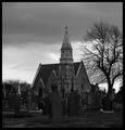
Eerieby michael_pComment by magicshutter: This seems like something I would have entered myself, but couldn't find anything that fit THIS idea. I personally like the emphasis on the cathedral. I have a great way to get the dodged/burned look without doing so. If you're interested email me after the challenge. |
| Photographer found comment helpful. |
| 03/28/2005 07:29:00 PM |
Eerieby michael_pComment by byoung: top half is in nice contrast to the sky .... bottom half too dark to make out much cemetery detail ... a difficult exposure situation |
| Photographer found comment helpful. |
| 03/27/2005 03:10:44 PM |
Naggedby michael_pComment by Evaan: I love this photo. Like how you've cropped it. Unfortunately, I don't see that it depicts boredom. |
| 03/27/2005 12:31:21 PM |
|
| Photographer found comment helpful. |
| 03/27/2005 08:13:40 AM |
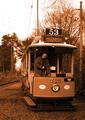
Tramtalisingby michael_pComment by andri: The sepia effect here is much too strong. In addition this is one those cases where the addition of a person in the photograph actually makes the picture worse as the man controlling the train is much too modern looking (lose the sunglasses, please) and in addition looking downwards instead of in the camera or at the rail-track.
I also fail to see the point with including the sky in the picture as it is totally white and of no interest. |
| Photographer found comment helpful. |
| 03/27/2005 02:11:18 AM |
|
| Photographer found comment helpful. |
| 03/26/2005 11:26:51 PM |
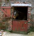
Naggedby michael_pComment by ace flyman: Nice image, thinking cropping a little tighter on the right side, right up to the edge of the dark neg. space in the door way. it would bring the subject more in the middle which is a no no, but the neg. dark space would take care of that problem.....just my opinion.. good colors, sharp....nice just the way its too......7 |
| Photographer found comment helpful. |
| 03/25/2005 02:39:56 PM |
Naggedby michael_pComment by audinut: I like this shot but I think it would have been better without the misc. bricks on the ground. None the less one of my favorites. |
| Photographer found comment helpful. |
Home -
Challenges -
Community -
League -
Photos -
Cameras -
Lenses -
Learn -
Help -
Terms of Use -
Privacy -
Top ^
DPChallenge, and website content and design, Copyright © 2001-2026 Challenging Technologies, LLC.
All digital photo copyrights belong to the photographers and may not be used without permission.
Current Server Time: 07/17/2026 12:36:04 PM EDT.