| Image |
Comment |
| 01/16/2004 02:49:51 AM |
|
| 01/15/2004 08:19:04 PM |
|
| 01/15/2004 09:45:04 AM |
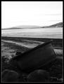
Old wheelby poxyComment by admart01: Nice double border, strong composition. I'd like to see more detail in the foreground. That might help me see a tighter connection to the theme. |
| 01/15/2004 12:46:52 AM |
Old wheelby poxyComment by Fayech: perhaps it is the settings on my screen vs urs, but the lower half seems very dull and lacks contrast/light to bring out the forms. could use a bit of adjustments in the levels to lighten it slightly. |
| 01/14/2004 08:12:33 PM |
Old wheelby poxyComment by Warby: Nice composition, but foreground is perhaps a little dark. |
| 01/14/2004 01:29:26 PM |
|
| 01/14/2004 11:53:01 AM |
Old wheelby poxyComment by drgsoell: Huge differences in light between top and bottom make it hard to see details at bottom. Definitely a different POV and B&W is good for this. |
| 01/14/2004 11:15:25 AM |
Old wheelby poxyComment by eaphelps: I really like the composition, but the subject is extremely dark and grainy. A shaper picture and some contrast adjustment would improve this a lost. |
| 01/14/2004 08:54:52 AM |
|
| 12/30/2003 06:30:27 PM |
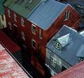
It looks higher up here :Sby poxyComment by Harz_Joerg: What I like is the variation of reds on the house and roof. Also the roofs texture is great. It's also well exposed and crisp.
To me the association to the challenge topic is a littlebit difficult, even with the title. Maybe you should have focused more to the roof edge in the title as well as in the image. |
Home -
Challenges -
Community -
League -
Photos -
Cameras -
Lenses -
Learn -
Help -
Terms of Use -
Privacy -
Top ^
DPChallenge, and website content and design, Copyright © 2001-2026 Challenging Technologies, LLC.
All digital photo copyrights belong to the photographers and may not be used without permission.
Current Server Time: 07/16/2026 11:54:02 PM EDT.