| Image |
Comment |
| 11/20/2004 02:15:50 PM |
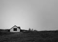
Gray daysby poxyComment by scottwilson: To me it looks like too much unsharp mask was used, I see bright lines around the roof. |
| 11/20/2004 02:02:51 AM |
|
| 11/19/2004 01:23:41 AM |
Gray daysby poxyComment by katcocat: I like the simplicity of this one. The huge expanse of sky makes for a great composition. Very nice. |
| 11/18/2004 08:47:39 PM |
Gray daysby poxyComment by Gatorguy: Pretty good use of negative space, compositionally. I don't find anything that really compels me to look very close or very long though. 6 |
| 11/18/2004 03:10:46 PM |
Gray daysby poxyComment by Rankles: Far too much bland sky.. and not enough foreground. Get closer or in better sight of the building and get less sky in. Just slightly mind you. |
| 11/18/2004 01:36:39 PM |
Gray daysby poxyComment by RatedR: I love the simplicity of this shot. It is hard for me to put my finger on it, but I really like this picture. |
| 11/18/2004 12:54:08 PM |
|
| 11/17/2004 07:25:45 PM |
|
| 11/17/2004 05:59:13 PM |
Gray daysby poxyComment by gruvin: Minimalist, simple, great use of negative space letting the sky speak it's own shades. I like it very much. 9. Good luck! |
| 11/17/2004 04:55:30 PM |
|
Home -
Challenges -
Community -
League -
Photos -
Cameras -
Lenses -
Learn -
Help -
Terms of Use -
Privacy -
Top ^
DPChallenge, and website content and design, Copyright © 2001-2026 Challenging Technologies, LLC.
All digital photo copyrights belong to the photographers and may not be used without permission.
Current Server Time: 07/16/2026 06:51:59 AM EDT.