| Image |
Comment |
| 02/20/2005 03:07:55 PM |
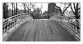
Central Parkby HomunculusComment by Kathy: A little crooked, but I love that you leave a little mystery to what's at the end of the bridge. |
| 02/19/2005 10:50:39 PM |
|
| 02/19/2005 06:45:11 PM |
|
| 02/19/2005 03:22:44 PM |
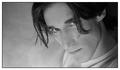
iby HomunculusComment by Jinjit: The light looks a bit flat and I would like this image with a bit more contrast.
But I like the pose and I think this one makes a nice portrait. |
| 02/18/2005 08:49:52 PM |
|
| 02/18/2005 08:48:38 PM |
|
| 02/18/2005 09:36:33 AM |
Central Parkby HomunculusComment by ecko313cheer: This is a very nice shot. I love the way you can see the curved lines in the bridge. I like the angle of the shot as well. I also like the fact that this shot is in black and white, I feel it really adds to the picture. nice work. |
| 02/18/2005 06:53:09 AM |
iby HomunculusComment by alien2thisworld: Composition: 8, Love this composition. Cropping out some of the head/face (like this shot) can really give an image a creative boost
Technical: 8, Great lighting and focus.
Appeal: 8, I like the tilt of the head.
Challenge: 8
Overall Calculated Average Score: 8 |
| 02/18/2005 06:45:50 AM |
|
| 02/17/2005 07:47:52 PM |
iby HomunculusComment by Neil: Good pose, nice composition. Perhaps this needed some leveling--it looks a bit muddy/flat to me--I would guess the whites are on the side of gray here. |
Home -
Challenges -
Community -
League -
Photos -
Cameras -
Lenses -
Learn -
Help -
Terms of Use -
Privacy -
Top ^
DPChallenge, and website content and design, Copyright © 2001-2026 Challenging Technologies, LLC.
All digital photo copyrights belong to the photographers and may not be used without permission.
Current Server Time: 07/16/2026 04:37:59 AM EDT.