| Image |
Comment |
| 09/01/2011 01:08:35 AM |
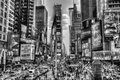
Times Square by genova24Comment by littlemav: One of my favorite places in the world!!!! B/W really accents the hussel and bussel, and is that Irene sneaking in the background? |
 Photographer found comment helpful. Photographer found comment helpful. |
| 08/30/2011 09:09:39 PM |
|
| Photographer found comment helpful. |
| 08/29/2011 11:33:42 PM |
Lotusby genova24Comment by sherpet: THE TWO DIFFERENT COLORS (Pink & Green) contrast realy well...
Feel the sun has given you some blow outs but some of those petals are just lovely to look at...
 GOOD TRY GOOD TRY
THANK YOU for entering this pleasing FLORAL image
from shez with love xox |
| Photographer found comment helpful. |
| 08/29/2011 09:23:31 AM |
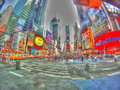
"C" is for Crowdsby genova24Comment by NiallOTuama: One of the ways I judge images and vote is as follows: do I think the processing effect lends itself well to the image?
In this case the answer is no. I would have loved to have seen this with subtler processing with perhaps the liberal saturation boost that is here if that's what you're looking for. I think a strong sharp contrasted image would have scored much better.
However, this is just my opinion. I don't know what you were trying to achieve. If it was this you did it excellently. I really do like the perspective used here. |
| 08/29/2011 08:57:40 AM |
"C" is for Crowdsby genova24Comment by colorcarnival: Originally posted by genova24:
Next time I know DPC is a more true to the art contest. Thanks for all of the comments and votes. |
DPC is hardly a true to the art contest. It's all about clear, simple, easy to view photos that have sharp detail and great color.
:)
Shoot what you love and don't let this place dictate how you do it. |
| 08/29/2011 08:52:59 AM |
"C" is for Crowdsby genova24Comment by snaffles: FWIW, this image strikes me more as digital art than a photograph. There are lots of cool elements here and it does like an interesting photo, with the fisheye and long exposure etc.
Keep up the good work, just go easy on the HDR! :-) |
| 08/29/2011 02:05:53 AM |
"C" is for Crowdsby genova24Comment by Leo: Originally posted by genova24:
I feel that with a different name like "Crazy Colors" this photo would have done better. I over processed it on purpose to exaggerate the colors of times square. Snce I entered this photo I have gotten lots of comments from people who either love it or hate it. Next time I know DPC is a more true to the art contest. Thanks for all of the comments and votes. |
Depending on how you define "success", you got feedback as to whether folks love it or hate it, a fair amount of comments. I would say this was a successful pic. Just my humble opinion though :) |
| 08/29/2011 12:06:00 AM |
"C" is for Crowdsby genova24Comment by genova24: I feel that with a different name like "Crazy Colors" this photo would have done better. I over processed it on purpose to exaggerate the colors of times square. Snce I entered this photo I have gotten lots of comments from people who either love it or hate it. Next time I know DPC is a more true to the art contest. Thanks for all of the comments and votes.
|
| 08/28/2011 11:19:25 PM |
|
| Photographer found comment helpful. |
| 08/28/2011 11:12:39 PM |
|
| Photographer found comment helpful. |
Home -
Challenges -
Community -
League -
Photos -
Cameras -
Lenses -
Learn -
Help -
Terms of Use -
Privacy -
Top ^
DPChallenge, and website content and design, Copyright © 2001-2026 Challenging Technologies, LLC.
All digital photo copyrights belong to the photographers and may not be used without permission.
Current Server Time: 07/17/2026 02:05:18 AM EDT.