| Image |
Comment |
| 06/20/2005 10:05:20 PM |
Mirror Image REMIXby DamianComment by jpochard: I really like the colors of this shot. Nice rosy corals and pinks. I also like the composition, with the tree branch hanging over and framing the top of the pic. I would probably crop just a smidge off of the left side. Nicely done. |
 Photographer found comment helpful. Photographer found comment helpful. |
| 06/20/2005 08:48:32 AM |
|
| Photographer found comment helpful. |
| 06/19/2005 11:46:49 PM |
|
| Photographer found comment helpful. |
| 06/19/2005 11:45:52 PM |
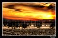
Field Of Dreams REMIXby DamianComment by jpochard: Amazing color. You do so well with the colors and presentations of your shots. This one really made me want to look at it for a while and just figure everything out...see what all is there and just enjoy it. I wish there was not quite the bright hot spot in the sky, but that's very hard to prevent in this type of shot. |
| Photographer found comment helpful. |
| 06/19/2005 11:43:53 PM |
Purple Rainby DamianComment by jpochard: This is awesome! I even like the title. I am a sucker for well done water drop photos, but the multiple drops in this one, along with the purple tones make it more out of the ordinary. I'm not sure I like the border all that much. Great job. |
| Photographer found comment helpful. |
| 06/19/2005 10:43:09 PM |
Underwater by DamianComment by Jutilda: That is totally cool. Very imaginative. The color saturation is excellent!! Great focus. |
| Photographer found comment helpful. |
| 06/19/2005 09:48:10 PM |
The Waitby DamianComment by jpochard: Aptly named piece. Good catch of the expression. I think your post processing in your people shots here have a sort of gritty feel to them that is purposeful and works well with your subjects. |
| Photographer found comment helpful. |
| 06/19/2005 09:45:46 PM |
In The Shadowsby DamianComment by jpochard: This is nice, but the more I look at it actually the less I like it. The gray area right near the middle is distracting. I like the softness of it, but the face appears out of focus...I think there's a subtle difference. Also, I would crop just a bit more off the left. All that being said...it's better than anything I could do probably! I especially like the lighting. |
| Photographer found comment helpful. |
| 06/19/2005 09:34:38 PM |
In The Shadowsby DamianComment by jenesis: Funny, I really like the texture and contrast the wall adds to this picture. I like softness and glow of her skin opposed to the grey rough wall. I think it adds alot. On the other hand the black graffiti on the wall might be a little distracting as it draws my attention from her. Overall, I think the shot is really great, great treatment. |
| Photographer found comment helpful. |
| 06/19/2005 09:27:38 PM |
The Waitby DamianComment by saracat: Very nice. Perfectly conveys the sense of waiting mixed with a touch of boredom and exasperation. Good color choice for the background - it sets off her skin tones without overpowering the picture. The lighting is maybe a touch harsh on her face, but it's not overpoweringly distracting. |
| Photographer found comment helpful. |
Home -
Challenges -
Community -
League -
Photos -
Cameras -
Lenses -
Learn -
Help -
Terms of Use -
Privacy -
Top ^
DPChallenge, and website content and design, Copyright © 2001-2026 Challenging Technologies, LLC.
All digital photo copyrights belong to the photographers and may not be used without permission.
Current Server Time: 07/16/2026 04:57:41 PM EDT.