| Image |
Comment |
| 09/08/2004 10:37:33 PM |
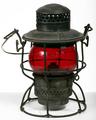
Adams & Westlake "Kero" Lanternby lwkimagesComment by dartompkins: Doesn't appear backlit to me. The shadows from the bottom of the lantern are being thrown to the back. I can see that the lantern is lit from the back by the glare on the handle, but the front and top lighting are overpowering the backlight. Still a very nice photo very simple, crisp, clear. I do like it. 5. |
| 09/08/2004 08:00:59 PM |
Come visit the Mighty Niagara!by lwkimagesComment by GBServis: Colors in the bakc ground of this photo look a bit washed out. It also might help to crop out the observation deck in the fore ground it seems to distract my attention from the falls a bit. I like the composition of your photo and the angle it was taken from. |
 Photographer found comment helpful. Photographer found comment helpful. |
| 09/08/2004 02:54:29 PM |
|
| 09/07/2004 09:48:02 AM |
|
| Photographer found comment helpful. |
| 09/07/2004 05:53:13 AM |
|
| Photographer found comment helpful. |
| 09/06/2004 04:15:37 AM |
|
| Photographer found comment helpful. |
| 09/06/2004 01:39:13 AM |
Come visit the Mighty Niagara!by lwkimagesComment by JPR: I was actually thinking about visiting. Tis is a great shot. I like that you have included the people. Would be excellent for a travel guide shot so that the people can imagine themselves standing there. At least, it worked for me. :) 8 |
| Photographer found comment helpful. |
| 09/05/2004 07:25:14 PM |
One Candleby lwkimagesComment by phoensoul: This is a lovely image, but I think it would serve the challenge criteria better if there were more difference between the pitchers (which I take to be your foreground) and the candle. You have depth, but I don't really see foreground/background here. It would also be better, I think, if there were a bit more space around the outside edges, particularly the sides. With so much lovely space around the flame, the handles really look like they're squeezing in to get in the shot. You might also consider getting a piece of fabric to function as a flooring, as the seams are very out of place and distracting among your lovely swirling forms and textures. |
| Photographer found comment helpful. |
| 09/05/2004 01:13:37 AM |
One Candleby lwkimagesComment by mocabela: This is very pretty, and I like the symmetry of the composition. The colour feels slightly flat, though.. it lacks warmth; it might benefit from conversion to a duotone, or a tiny bit of levels tweaking - of course, that might also throw away the detail of the candle. At any rate, it's a unique photo that meets the challange fairly well. |
| Photographer found comment helpful. |
| 09/04/2004 10:26:11 PM |
|
| Photographer found comment helpful. |
Home -
Challenges -
Community -
League -
Photos -
Cameras -
Lenses -
Learn -
Help -
Terms of Use -
Privacy -
Top ^
DPChallenge, and website content and design, Copyright © 2001-2026 Challenging Technologies, LLC.
All digital photo copyrights belong to the photographers and may not be used without permission.
Current Server Time: 06/25/2026 06:56:45 PM EDT.