| Image |
Comment |
| 10/27/2003 08:48:16 AM |
|
| 10/25/2003 06:31:31 PM |
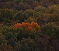
Alone in the Wildernessby bexforlifeComment by LucidLotus: Nice interpretation! I love the color difference, it is afterall what makes the shot work for 'all alone'. I think more of the green/brown trees surrounding would help enhance that feeling - not sure if a wider shot was possible. Also, I wish the tones were a bit lighter, I think it would've boosted the colors just a bit. Other than that, I like the composition and vision behind the image. Well done. 7 |
 Photographer found comment helpful. Photographer found comment helpful. |
| 10/24/2003 01:31:33 PM |
|
| 10/22/2003 03:08:33 PM |
|
| 10/22/2003 02:24:18 PM |
Alone in the Wildernessby bexforlifeComment by Trinch: I was just in the forums trying to explain how 'alone' can be portrayed in a picture of a group and then I come across this photo. I just wish I can use it as an example. You have done exactly what I was describing. Very nice composition. But.... I think it would be nicer if it were brighter. |
| Photographer found comment helpful. |
| 10/21/2003 07:28:02 AM |
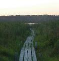
restful lakeby bexforlifeComment by OneSweetSin: "Critique Club"
Not sure where to start with this other than I understand why you scored so low on this. For starters this was URBAN landscape and the discription of the challenge said it should have buildings in it. I don't see any buildings at all in your photo.
Now you do have an interesting subbject with that wooden walkway. You should try shooting it so that the walk starts at one corner of your photo and goes part way across you photo leaving the lake near the opposite side of the photo.
This could be a lot stronger as it is if it was a little brighter and you either use a haze filter or you play a little with the contrast and saturation to get rid of the gray hazy. |
| 10/14/2003 03:02:51 AM |
|
| 10/13/2003 06:25:44 PM |
|
| 10/13/2003 02:06:00 PM |
restful lakeby bexforlifeComment by hgpayne: base 1: 1/1; challenge: 0/3; technical: 2/3; aesthetics: 0/3; total: 3
Nothing Urban or even buildings here. Focus too soft, color levels could use adjustment to make it more dynamic and less flat. Sky is blown out/white. In another "open spaces" type challenge, this photo might do better. Nice idea for such an 'open spaces' type shot, but execution could use some work. |
| 10/13/2003 01:21:14 PM |
|
Home -
Challenges -
Community -
League -
Photos -
Cameras -
Lenses -
Learn -
Help -
Terms of Use -
Privacy -
Top ^
DPChallenge, and website content and design, Copyright © 2001-2026 Challenging Technologies, LLC.
All digital photo copyrights belong to the photographers and may not be used without permission.
Current Server Time: 07/16/2026 03:02:03 PM EDT.