| Image |
Comment |
| 12/11/2025 03:01:53 AM |
Autumn Blossom with Beeby kanajComment by primabarbara: The processing definitely creates a retro vibe. Looks like a picture from the 70s.
I would rather expect that on lifestyle and fashion (as you mentioned) but not necessarily in nature |
 Photographer found comment helpful. Photographer found comment helpful. |
| 12/11/2025 02:45:56 AM |
|
| Photographer found comment helpful. |
| 12/11/2025 12:59:35 AM |
melancholyby kanajComment by kanaj: Originally posted by Art Roflmao:
Soft, delicate, muted and wet. Just how I like my women. Heeheee. ;p |
Oh my. |
| 12/11/2025 12:38:39 AM |
|
| Photographer found comment helpful. |
| 12/10/2025 08:42:30 PM |
|
| Photographer found comment helpful. |
| 12/10/2025 07:16:01 PM |
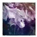
melancholyby kanajComment by jomari: This is very pretty. I like the way the processed colours work with the directionality of the flowers. The raindrops are beautiful. |
| Photographer found comment helpful. |
| 12/10/2025 07:14:40 PM |
|
| Photographer found comment helpful. |
| 12/10/2025 05:38:49 PM |
|
| Photographer found comment helpful. |
| 12/10/2025 02:04:52 PM |
Autumn Blossom with Beeby kanajComment by nam: Originally posted by kanaj:
Originally posted by nam:
What does a contrast boost - a big one :) - do for it? |
Well, it would definitely take it in a different stylistic direction than I intended with this edit. :-) Here, I'm going here for a warm, sun-faded matte/distressed-film treatment, so I've actually used some processing decisions to reduce rather than enhance contrast--and to introduce grainy imperfections. But admittedly, it's a stylistic voice that doesn't resonate with all viewers. And I'm far from the best I've seen at recognizing when and how to apply it effectively. But since it seems to be popular in stock photography right now, especially among DTC brands in the fashion and progressive lifestyle space, I'm experimenting with ways to incorporate it into my portfolio of work.
Appreciate your kind words! |
Got it. I kind of wondered whether the faded look was intentional. |
| Photographer found comment helpful. |
| 12/10/2025 01:32:40 PM |
Autumn Blossom with Beeby kanajComment by kanaj: Originally posted by nam:
What does a contrast boost - a big one :) - do for it? |
Well, it would definitely take it in a different stylistic direction than I intended with this edit. :-) Here, I'm going here for a warm, sun-faded matte/distressed-film treatment, so I've actually used some processing decisions to reduce rather than enhance contrast--and to introduce grainy imperfections. But admittedly, it's a stylistic voice that doesn't resonate with all viewers. And I'm far from the best I've seen at recognizing when and how to apply it effectively. But since it seems to be popular in stock photography right now, especially among DTC brands in the fashion and progressive lifestyle space, I'm experimenting with ways to incorporate it into my portfolio of work.
Appreciate your kind words! |
Home -
Challenges -
Community -
League -
Photos -
Cameras -
Lenses -
Learn -
Help -
Terms of Use -
Privacy -
Top ^
DPChallenge, and website content and design, Copyright © 2001-2026 Challenging Technologies, LLC.
All digital photo copyrights belong to the photographers and may not be used without permission.
Current Server Time: 06/12/2026 08:32:02 AM EDT.