| Image |
Comment |
| 12/30/2003 08:29:41 AM |
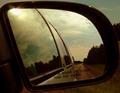
lonely roadby sweetnsourgeoffComment by TooCool: From the Critique Club
I liked this shot during the challenge for the composition! You have a couple of good and bad issues to address here.
Good points: Original take on challenge always gets a little bonus in my book! I like how the vehicle is in the shot, even a prominent part of the shot, but still doesn't seem to be the subject of the shot! You did a good job of taking the shot and not being in it! This can be tricky when dealing with any reflective surfaces! (In my first macro shot I gave up and made myself part OF the photo!)
Bad points: This is very noisy which to me means not enough light! This added to the odd tonality leads me to believe that you shot this through the tinted windows. If this is the case, opening the window or playing around with the levels in Photoshop should help. As a whole the shot doesn't have much staying power. I attribute this to the composition. While an interesting angle, this alone isn't enough to keep attention! I think a different crop (not so tight) would help! Also, now I'm being a little nit picky, but this was in effect a set up shot. You had almost total control over all elements. Given a choice the driver side mirror would probably have made for a better overall affect! You wouldn't have the lettering or other markings on the mirror itself or the distortion of the reflection.
This is a good example of a photo that you can turn into a study. Play around with it in different locals, different times of day (lighting) and from slightly different angles to see what different 'feelings' you can get from the shot! If you get some good ones, you can post the here for us to see!
TC |
| 12/29/2003 11:15:03 AM |
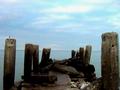
the endby sweetnsourgeoffComment by Olyuzi: Neat photo! Although it seems a bit small, I really like the contrast of blue and brown tones and I like the feeling of perspective here. Negatives would be the loss of detail in the dock from underexposure and the artificially manipulated look to the color of the sky But overall, I like it. |
| 12/28/2003 11:25:00 PM |
the endby sweetnsourgeoffComment by jenesis: I think we lose a lot of details due to the size of the picture, would've like to have seen it larger. I like the colors and textures of it. |
| 12/28/2003 05:33:09 PM |
|
| 12/27/2003 02:57:46 PM |
|
| 12/27/2003 11:16:52 AM |
the endby sweetnsourgeoffComment by cbeller: good idea. Two things that I think would improve this. 1- come at this from a different angle to make it a little more interesting. 2- if you can submit a larger image, I think it will help. |
| 12/26/2003 08:55:26 AM |
|
| 12/26/2003 08:05:34 AM |
|
| 12/25/2003 05:07:17 PM |
|
| 12/24/2003 10:02:16 PM |
the endby sweetnsourgeoffComment by keone: I like the composition but I would have sized the photo closer to the max allowable so that everyone can see more detail. I think you will take a hit in your score because of the size. |
Home -
Challenges -
Community -
League -
Photos -
Cameras -
Lenses -
Learn -
Help -
Terms of Use -
Privacy -
Top ^
DPChallenge, and website content and design, Copyright © 2001-2026 Challenging Technologies, LLC.
All digital photo copyrights belong to the photographers and may not be used without permission.
Current Server Time: 07/16/2026 11:26:59 PM EDT.