| Image |
Comment |
| 10/04/2004 07:52:52 PM |
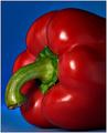
A Study in Colorby HRoxasComment by Imagineer: Lush and tasty, which is a good thing to sense from a photo of food! Great choice of colour and lovely focus. |
 Photographer found comment helpful. Photographer found comment helpful. |
| 10/04/2004 07:15:40 PM |
|
| Photographer found comment helpful. |
| 10/04/2004 01:24:23 PM |
|
| Photographer found comment helpful. |
| 10/04/2004 12:56:16 PM |
|
| Photographer found comment helpful. |
| 10/04/2004 12:33:04 PM |
|
| Photographer found comment helpful. |
| 10/04/2004 10:57:42 AM |
A Study in Colorby HRoxasComment by brownt: Really clear colours here, stands out extremely well. Might have liked some droplets of water on the pepper to make it more appealing. 8 |
| Photographer found comment helpful. |
| 10/04/2004 08:09:01 AM |
A Study in Colorby HRoxasComment by Refocused: This is simply a well taken still life. Colors, sharpness, positioning, lighting and DOF are right on. The only negative in comparison with some of the other shots is that it is not terribly original or interesting but I don't think you were going for that. I think you were just trying to take the best technically possible shot you could and you have succeeded. |
| Photographer found comment helpful. |
| 10/04/2004 07:30:22 AM |
A Study in Colorby HRoxasComment by willem: A technically perfect image with great primary colors, composition and lighting. A good specimen as well. It unfortunately fails to touch me emotionally like some other good images in this challenge do, which is why it ends up a bit lower in my ranking. |
| Photographer found comment helpful. |
| 10/04/2004 05:46:58 AM |
A Study in Colorby HRoxasComment by jonpink: A nice still life shoot! Not the most exciting subject for a masters challenge but technically this is 100%.
|
| Photographer found comment helpful. |
| 10/03/2004 09:08:41 PM |
A Study in Colorby HRoxasComment by photom: Strong points: Simple yet effective combination of colors. Exposure right on. Excellent DoF. Lighting handled well.
Suggestions for improvement: Composition is pretty static - consider more diagonal placement. Crowded on the left. White border ok, but not needed. |
| Photographer found comment helpful. |
Home -
Challenges -
Community -
League -
Photos -
Cameras -
Lenses -
Learn -
Help -
Terms of Use -
Privacy -
Top ^
DPChallenge, and website content and design, Copyright © 2001-2026 Challenging Technologies, LLC.
All digital photo copyrights belong to the photographers and may not be used without permission.
Current Server Time: 06/12/2026 01:56:54 PM EDT.