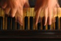
Life is like a piano... what you get out of it depends on how you play it.by
p-chanComment by JamesDowning: Greetings from the Critique Club!
My first take-away is the title in particular. Great title. So much meaning can be extracted from it.
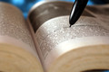
Image wise, I like the concept. Obviously something hit voters well, as a 5.95 is in very good territory. Still, I think it could potentially be improved. When I first look at the image, to me it looks rather yellow. I decided to play with it a bit myself, and applied an auto-levels layer at about 70% opacity in photoshop. That seemed to cut off the overtly yellow hue, while not really disturbing the yellow aged look of the keys.
I like the composition. The horizontal layers work well together. There's a nearly abstract quality to it and I really like that you focused in on a unique viewpoint. I do think the out-of-focus lower section detracts from the image a bit. If that had been in clear focus, I think it could have brought out even more of an aged feeling to the image. In an image like this, I think that's what makes it. The piano is representing life. Life is full of stories, memories, etc. which are represented by the scratches, nicks, scrapes, and other patina that grow over the years of use. That very interesting bit of photograph are however rather obscured by the lens blur. I'm actually a bit surprised that at F8 on a DX body it wasn't more in focus. I'd suggest testing a few stops down, f11-f16 and see how that affects the blur. If nothing else, since it's advanced editing, you could stack two photos with the two different focus points to achieve the desired level of detail. Again, this is just thought. Detail there could completely ruin the photo, who knows!
As I stated before, I did import your photo into PS and started playing with it some. As an alternative to making the lower section in focus, I ended up cropping off 75% of the out of focus area. That became a very wide photo, and as I've found, wide crops don't do so well. So that leaves us with two options, both of which I felt were potentially stronger than your original image. (Keep in mind, it's just my opinion.) One option is to add in a letterbox frame. I think it helps emphasize the horizontality of the shot, and ensures the eyes aren't drawn out of frame by the bright hands. Option two is to crop off the left and right most of the frame. This crops off the pinky of each hand, but actually gives a very balanced image, in my opinion. Just enough visual information to let the viewer know what you're doing, while keeping the subject front and center. Of the two crop options, this may be my favorite as it emphasizes the abstract quality of the image.
Again, a great concept, and a nice execution! Looking forward to seeing more from you in the future!
Food for thought.
James Downing