|
|
|
Showing 1251 - 1260 of ~2548 |
| Image |
Comment |
| 05/24/2003 11:37:11 PM | |  Photographer found comment helpful. Photographer found comment helpful. |
| 05/24/2003 10:45:30 PM | Strawberry Fields........Forever?by autoolComment by BJ: I like this photo. I almost hesitate to say this, but my focus is drawn more to the person than the strawberries. Would think this meets the challenge better if cropped just to the left of the person and incorporating the rule of thirds. Just my opinion - still a good score:) | | Photographer found comment helpful. |
| 05/22/2003 10:29:13 PM | | | Photographer found comment helpful. |
| 05/22/2003 08:14:18 PM | Strawberry Fields........Forever?by autoolComment by qachyk: I'm torn. On the one hand, for the sake of the contrast of the complementary colours, I might say "move the focus in on the berries a bit more!" On the other hand, you'd need a new title and that was kinda funny. :)
Reasonable, and a pretty picture. |
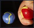
| 05/22/2003 08:05:33 PM | The Shooterby autoolComment by autool: Stephan and Mavrik,
I feel flattered that I received not one, but two very well written and honest critiques on my "The Shooter"
As you have pointed out my lighting is harsh and I have dirty fingers!
About the light, that is one of my biggest problems, I have just not been able to get the hang of lighting, I need to shoot and shoot until I get it.
About the fingers, oh if you only knew me! I am the most retired, retired person you can imagine. If I am not taking pictures I am playing with my 1960 Alfa, or my 1955 Chevy Cameo, or making a new type of tool on my milling machine and lathe, and if I get really bored I might paint part of the house, Yuck!
Well I got the idea for the marbles when doing some machine work and didn't even think about a scrub down for the modeling job. When I noticed the dirt in my images, I took the easy way out and decided that if it were a kid his fingers would have been dirty too.
I appreciate your critiques and also your contributions to DPC. When
accomplished photographers such as yourselves, pass such positive remarks down on my work, it encourages me to go out and do some more.
Thank you both, keep shooting, and most of all have fun.
Dick
|
| 05/22/2003 09:52:58 AM | Painted Ladyby autoolComment by autool: Connie,
Finally, I am getting around to my mail. Thank you for your wonderful and complimentary evaluation of my "Painted Lady".
It was a wonderful Saturday in San Francisco, a rare clear day with very little wind. When I finally found the Mish House I immediately found the difficulty in getting pictures with normal lenses. A professional could have worked around this problem but as a novice I was quite lost. I was not happy with the flat finish on the house, from the information I had, I assumed it would be bright and shiny. I had came to specifically do this house and that is what I did.
I feel that you have given it a fair and honest critique, and certainly one that I appreciate. Of the many different crops, saturations and tilts I settled on this rendition-which probably doesn't do the old Victorian justice. I knew that the subject was a little off the challenge but as you probably can tell from reviewing my earlier entries, that doesn't really matter much to me. The entry would have had to be a lot splashier with defined colors, and a little trickery to do well on DPC, but I like it and several others liked it, and most of all I had fun doing it.
You must have a never-ending array of subjects in beautiful Montana. Your pictures reflect your ability to seek and present them for our enjoyment please don't ever stop!
Thank you, keep shooting, and most of all have fun.
Dick
|
| 05/21/2003 03:37:08 PM | Painted Ladyby autoolComment by CLarson557: Greetings from the Critique Club
by CLarson557
Hi Richard,
I'm not sure as I feel qualified to critique your images. I have seen and admired your work since I first joined DPC, so you are someone who I have learned from. I especially like your creativity with the subjects of your photos. So, instead of saying critique, I'm going to attempt to express my thoughts as I view your photo as a part of my assignment in the Critique Club.
Meeting the Challenge: Yes, you met it. You definately chose a wonderful subject to meet the objective of the challenge. This looks like a very interesting building to see in person.
Composition: The angle at which you shot this picture is nice and effective. I agree with you...with the angle, you are able to see details that you would probably wouldn't otherwise see. The moon showing up next to the building is a nice touch. With the overcast sky and lack of clouds, it provides something different and interesting. However, with this picture, I may have cropped it a little closer to the moon taking out more of the blaa of the sky. Also, I may have cropped out a little off the right side of the building closer to the corner pillar...just to get it closer to a printable sized picture. I think that would be possible without taking out important aspects of the building.
Technical Aspects: Appears to be well focused. Can easily see the details of the building. Someone mentioned in the comments that they thought it looked grainy but I don't see it. I think the top darkened windows have some sort of texture to it that might look grainy in the picture but other than that, I don't know what they are seeing. I do believe, however, that the colors could "pop" out a little more. They appear muted. Perhaps adjusting the contrast and/or pushing up the saturation a little would make the colors stand out more.
Overall: Richard, it's another interesting and unique photo to add to your portfolio. I'm always anxious to see what you come up with next.
I hope you found this helpful.
Connie | | Photographer found comment helpful. |
| 05/20/2003 11:35:20 PM | The Shooterby autoolComment by stephan: Greetings from the Critique Club, Richard! :)
Composition: In my opinion the photo needs more space. Your hand is very near the blue marble. It's not like you're really aiming at it from such a short distance. A landscape composition with the blue marble on the one end and the red one on the other would make it more clear that it's the kid's game you want to show. Another issue I see is that the blue marble seems to float because all background is totally black. There is no reference point like the floor to see.
Lighting: Hmm.. you wrote you used subdued light? Well actually I would say it's a bit harsh. Almost like flash. I think that's the biggest issue on this photo. The lighting doesn't look good.
Focus: All in focus. This makes the photo look a bit flat. Especially in combination with that lighting. Maybe a more narrow DOF would add drama to the shot. I don't know if you tried it but I think some motion blur to show a movement of one marble would make the photo more interesting and your message more understandable.
Challenge: Yes, it meets the challenge.
Creativity: I don't know if you left the dirt under your fingernails there on purpose, like jmsetzler thought, but I agree that this adds to the kids theme. But like justine'scomment suggests, a different setting, not this clean studio shot, would have made this more understandable. Aynway, I think you had a good idea and your photo shows more creativity than flower shot number xyz.
Ok, that's it. I hope I could help.
Ciao, Stephan | | Photographer found comment helpful. |
| 05/20/2003 11:23:29 PM | The Shooterby autoolComment by wewillexplore: Greetings from the Critique Club
Hi Richard!
Composition
A shooter (to answer someone's question) is the person who's flicking the marbles into each other. In this case, I answered under composition because I'd love to see the whole shooting thumb (and yes, clean it).
Color
The colors are good, but the dark blue on the right blends with the black background. Otherwise, it's good.
Focus
I like the focus on this shot - but it's a bit TOO sharp here - shows the dust specs and dirt.
Lighting
The light is a bit harsh - direct lighting with the reflection doesn't work for me here. Try diffusing - eliminate the spots.
Subject matter
I love how you found the yellow as swirls - not using a different marble. Nice work there. I like the hand included - you know the only problems there.
Overall
Down from your previous shoots - but mostly because of lighting and dirt. Check, check, check! Studio shots need to be as good as you can get them - everything is under your control.
Happy shooting!
M
| | Photographer found comment helpful. |
| 05/20/2003 11:19:19 PM | Painted Ladyby autoolComment by Bitz: Your painted lady is beautiful with the moon peeking over her roof. Good composition and colors. |
|
Showing 1251 - 1260 of ~2548 |
Home -
Challenges -
Community -
League -
Photos -
Cameras -
Lenses -
Learn -
Help -
Terms of Use -
Privacy -
Top ^
DPChallenge, and website content and design, Copyright © 2001-2026 Challenging Technologies, LLC.
All digital photo copyrights belong to the photographers and may not be used without permission.
Current Server Time: 06/17/2026 04:18:34 PM EDT.
|