| Image |
Comment |
| 06/03/2003 01:25:31 PM |
|
 Photographer found comment helpful. Photographer found comment helpful. |
| 06/03/2003 05:10:41 AM |
|
| Photographer found comment helpful. |
| 06/02/2003 11:31:37 PM |
|
| Photographer found comment helpful. |
| 06/02/2003 08:46:02 PM |
"The Break"by autoolComment by brentg3: This shot would have been more effective if a flash was fired on second curtain, here it seems that the balls are moving into the group and not away from the group which, I realise, was you intention! |
| Photographer found comment helpful. |
| 06/02/2003 08:01:30 PM |
Family Valuesby autoolComment by JPR: very nice. i dont really like the flag the way it is in the top corner. i would have made it more visible or left it out. |
| Photographer found comment helpful. |
| 06/02/2003 05:04:31 PM |
|
| Photographer found comment helpful. |
| 06/02/2003 02:11:00 PM |
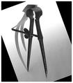
Shadow Danceby autoolComment by GeneralE: The shape of the shadow (and time of year) makes me want to re-title this "Senior Prom."
I think I agree about either bringing out detail in the divider (screw threads), or get rid of the specular highlight and let it also be a soft, gray, semi-silhouette (shadow-like). Maybe take another version and spot-edit those highlights out to see.
Without messing with it I can't tell if rotation would help -- I think you got the "point" across pretty readily. |
| Photographer found comment helpful. |
| 06/02/2003 01:29:13 PM |
"The Break"by autoolComment by jerrft: This is just a suberbly executed shot! If I had any complaint, it would be with the blue felt (instead of green). 9 |
| Photographer found comment helpful. |
| 06/02/2003 12:12:18 PM |
Shadow Danceby autoolComment by HBunch: *Critique Club*
I think I'm missing something. Someone said to use a simple border. Does it get much simpler? It's white.
The only thing I can think of is that the black triangles are not part of the photo, rather part of the border?? It looks like a white paper which was angled on a black background. maybe it's ME that is seeing it wrong? Oh well.
As for the photo. It's a really great photo. The only thing that I can really see that I'd like to see improvement on would be the focus. It seems like it's generally soft throughout the photo. Both the shadow and the object are soft. Maybe at least have the points sharp? I can also see that there is a screw section in the middle, but those are soft also. Maybe it just seems that way cause of the light.
The lighting I think it good. I love the shadow, and think that it's a really important part of this shot doing well. I like how the white surface fades from bright at the top to a bit darker at the bottom.
The angle is interesting, though I find myself tilting my head to try to look at it. I'm not sure why, but aparently my brain wants to see this horizontal. Visually though I like the angle you put it at. I think it's nice. But still trying to turn my head. lol
I like the darkness of the object on the light of the paper. Great shot.
~Heather~ |
| Photographer found comment helpful. |
| 06/02/2003 10:44:52 AM |
"The Break"by autoolComment by Kneeforu: Great idea and shot, no pun intended. It portrays motion better than sound, but still a great shot! |
| Photographer found comment helpful. |
Home -
Challenges -
Community -
League -
Photos -
Cameras -
Lenses -
Learn -
Help -
Terms of Use -
Privacy -
Top ^
DPChallenge, and website content and design, Copyright © 2001-2026 Challenging Technologies, LLC.
All digital photo copyrights belong to the photographers and may not be used without permission.
Current Server Time: 06/17/2026 04:18:24 PM EDT.