| Image |
Comment |
| 10/11/2010 05:01:54 AM |
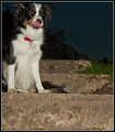
Gotcha!by Jon_HComment by steve100: Meets Challenge 8 Impact 5 Technicals 5 Processing 5 Creativity 5 Total (weighted) 6
A little less step at the bottom and more room above the dogs head would have improved this shot |
 Photographer found comment helpful. Photographer found comment helpful. |
| 10/09/2010 05:47:58 AM |
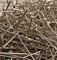
Sweating For Safetyby Jon_HComment by lawrysimm: I think for this sort of shot to be successful, you really need a larger water drop in which to get the reflection. As it stands it's really hard to see the definition reflected in the droplets that you were aiming for. Also, I'm not sure about the crop... I think if you go for a narrow image like this, just sticking a "letterbox" border on it can help flesh it out a bit. Finally, I think the lots of little drops detract the eye from the couple of larger drops in which the reflections are. Maybe instead of using a mister, you could have used an eyedropper or similar? |
| Photographer found comment helpful. |
| 10/07/2010 03:48:30 AM |
|
| Photographer found comment helpful. |
| 10/06/2010 10:37:22 AM |
|
| Photographer found comment helpful. |
| 10/06/2010 08:59:11 AM |
|
| Photographer found comment helpful. |
| 10/05/2010 06:03:17 PM |
|
| Photographer found comment helpful. |
| 10/05/2010 03:14:47 PM |
|
| Photographer found comment helpful. |
| 10/05/2010 12:01:07 PM |
|
| Photographer found comment helpful. |
| 10/05/2010 03:28:16 AM |
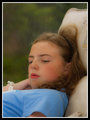
"A Penny For Your Thoughts"by Jon_HComment by spiritualspatula: Hello from the Critique Club-
The first thing that strikes me about this is that you have not made the chair a more important element in the photo. Some will vote you down for this, others could care less, but it is something to consider.
As far as technical details go, I think you have done a good job capturing her. I appreciate the softness to the image, and think it matches the mood of the photo/her pose well. Your background has been nicely blurred and is not distracting, keeping our attention focused where it should be. I agree with  EL-ROI EL-ROI that there is too much empty space in the top left. I see her face, and then go back up to the empty area even though there is nothing there. I think I personally may have gone with a little bit more contrast, though that does go contrary to your more dreamy approach, so that would be a personal difference. One thing, though, that I think this would benefit from, is a slightly different pose for your daughter. The mostly closed but partially open mouth is just an awkward middle ground. While I appreciate your use of an off-frame gaze, I’d like to see more of her eyes. Eyes are very important in photographs, and they help us connect as viewers. In this case, I think it might have increased our intrigue and curiosity. Overall, a solid portrait, especially when it comes to lighting, which is very even and pleasing.
|
| Photographer found comment helpful. |
| 10/04/2010 09:26:23 AM |
|
| Photographer found comment helpful. |
Home -
Challenges -
Community -
League -
Photos -
Cameras -
Lenses -
Learn -
Help -
Terms of Use -
Privacy -
Top ^
DPChallenge, and website content and design, Copyright © 2001-2026 Challenging Technologies, LLC.
All digital photo copyrights belong to the photographers and may not be used without permission.
Current Server Time: 06/21/2026 09:25:38 PM EDT.