| Image |
Comment |
| 03/01/2006 08:15:03 AM |
|
 Photographer found comment helpful. Photographer found comment helpful. |
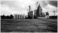
| 03/01/2006 02:16:24 AM |
Big City Meets the Middle of Nowhere.by tryals15Comment by Rikki: I hope you see my comment as constructive and helpful in your pursuit to improve your photos ;)
My first impression of this image is that it is a well taken shot. Too much ground IMHO. I think with a greater expanse of the sky serving the negative space, this would have been up there. The tonal qualities are good but could use slight improvement. As you can see, some of the trees almost go to black in the background. The noise helps this image. It adds a certain flavor to the whole composition.
Keep on practicing but most importantly have fun! This is a great image!
Cheers,
Rikki Message edited by author 2006-03-01 15:45:55. |
| Photographer found comment helpful. |
| 03/01/2006 12:59:27 AM |
Big City Meets the Middle of Nowhere.by tryals15Comment by DrAchoo: It's not a bad shot. I didn't make it to this one in the voting. The biggest problem is the sky not having enough definition because of the exposure. I see you were already on 1/1000th. Perhaps a different time of day? or with a polarizer or ND filter? The horizon exactly splits the picture, which isn't always bad, but probably is a bit static here. I see you were trying to contrast the expanse of blank with the building, but perhaps less dirt would have been better in the end. I would have given it a 5, which is right where you finished. |
| Photographer found comment helpful. |
| 02/26/2006 09:35:24 PM |
Eiffel Tower Study #3by tryals15Comment by UNTITLED: Amazing how many creative ways you can find to photograph the eiffel tower. Your entire series is very good! This one is great, I love the detail in the ironwork. Great work! |
| Photographer found comment helpful. |
| 02/25/2006 07:52:34 PM |
|
| Photographer found comment helpful. |
| 02/24/2006 08:50:50 AM |
|
| Photographer found comment helpful. |
| 02/23/2006 11:10:57 PM |
Storm's Rollin' Inby tryals15Comment by tinmason: I think you have a good image here...needs just a bit more work. The overall concept behind the composition is good; however, The horizon is too busy. I would have tried cropping part of the right side of the image and remove the last building and trees and leave just one tree on the right to balance with the trees on the left. The tree just to the right of the building at the center of image, I would have cloned out as I felt it created a distracting edge with the cloud. I think thats a stop sign just to the left of the building at center. Reminds me of a four way stop on a lone country road and a point of interest and I may have cloned out the trees next to it to make it stand out much the same as the pole next to the building just left of center. Now, having said that, I took the image into photoshop to see if any of this worked. I think removing the tree right of building at center helped and also cloning out the tree behind the building at center helped; however, cropping the right side of the image did not. I also tried increasing the curves and saturation which helped the right side of the image somewhat and did help add some impact to the clouds. One thing about the clouds I did find distracting was the blues and although the blue works well with the yellows in the horizon, I felt they pulled the eye away from the horizon. The last thing I would try is to change is the border. The white in the border kept pulling my eye away from the image and didn't work for me; however, borders like photography are very subjective. The wrong border can hurt an image in the voting. I did try the image with 2 to 5 pix black border and felt it worked better. In summary, adding some curves and saturation to the clouds with selective editing, playing with the horizon to remove distracting elements, and adjusting the border would have helped move the image up in the voting. Even though the horizon may need some minor adjustment, I also think it was the strength of the image. A very nice silouhette! IMO, just needs a little work. If you have question, please contact me through the PM system. One last word, After looking at your profile, I see good things a little down the road for you!! |
| Photographer found comment helpful. |
| 02/23/2006 12:18:54 PM |
|
| Photographer found comment helpful. |
| 02/22/2006 03:37:42 PM |
A Study of Destruction #3by tryals15Comment by ShutterPug: I like shots with old posts and rocks, but this seems a bit too busy. I didn't even notice the person at first look. Wonder if doing a selective desat on this would be better - leaving just the person in color? Also, might try bumping the contrast on the rocka |
| Photographer found comment helpful. |
| 02/22/2006 03:35:55 PM |
|
| Photographer found comment helpful. |
Home -
Challenges -
Community -
League -
Photos -
Cameras -
Lenses -
Learn -
Help -
Terms of Use -
Privacy -
Top ^
DPChallenge, and website content and design, Copyright © 2001-2026 Challenging Technologies, LLC.
All digital photo copyrights belong to the photographers and may not be used without permission.
Current Server Time: 07/17/2026 02:54:50 AM EDT.