| Image |
Comment |
| 11/15/2006 01:07:29 PM |
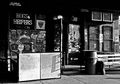
The Hogby roby21112Comment by Ivory: Nice composition, would have liked to see a little more detail maybe the background is just a little to dark. |
 Photographer found comment helpful. Photographer found comment helpful. |
| 11/13/2006 09:11:16 PM |
The Hogby roby21112Comment by noraneko: All on scale of 0-2
Lighting: .5
Composition: .5
Focus: 1
Creativity: 1
"Wow Factor": 1
Total: 4
Maybe consider cropping a smaller section? There is a lot going on and the highlights in front detract from the more interesting area behind IMO. |
| Photographer found comment helpful. |
| 11/13/2006 04:30:42 PM |
The Hogby roby21112Comment by Falc: The contrast difference between the dark and light is extremely strong here. It probably needs a little less contrast |
| Photographer found comment helpful. |
| 11/13/2006 12:11:05 AM |
|
| Photographer found comment helpful. |
| 10/17/2006 04:13:23 PM |
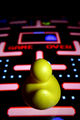
Where did everyone go?by roby21112Comment by CNovack: The concept is a good one but it needs improvement to move it out of the average shot into an above average shot. Lighting and focus needs improvement. The background and duck could be in sharper focus if you try a smaller aperature. An 8 or greater would increase the sharpness in the depth of field. The tricky part would be the lighting. While you may get everything in sharp detail of the game it maybe too much light exposure for the game or too little light to properly illuminate the ducky. Taking lots of shots and experimenting with ISO as well as aperature settings might yield the correct combination needed. Concept is good. I don't see the ducky as a player playing a video game. Because his color is yellow like Pac-man, I immediately think of the ducky taking the place of Pac-man in this video game. One thing the composition suffers from is that the ducky's face is never seen. If you placed the ducky was in a side profile view, had it's mouth open, and positioned such that the mouth looked like it was chomping on the white dots about to eat a blue ghost it would strengthen the connection of the ducky being Pac-man. A bonus would be that we would see the duck's face rather than it's backside. |
| Photographer found comment helpful. |
| 10/17/2006 03:23:12 PM |
Where did everyone go?by roby21112Comment by EGoobie: It is blurry and I can't see the ducky's face. It is a great idea. It needs to be less blurry. The ducky could be at a different angle. Show his face. |
| Photographer found comment helpful. |
| 10/14/2006 08:39:47 AM |
|
| Photographer found comment helpful. |
| 10/12/2006 11:31:56 PM |
|
| Photographer found comment helpful. |
| 10/12/2006 10:03:29 PM |
Where did everyone go?by roby21112Comment by GrayGhost: Great idea, composition, low-angle perspective, and DOF. I think that working in the ducky's face would be better, but it would probably take some experimenting with either different arrangements or a different angle from the side. |
| Photographer found comment helpful. |
| 10/12/2006 09:01:01 AM |
|
| Photographer found comment helpful. |
Home -
Challenges -
Community -
League -
Photos -
Cameras -
Lenses -
Learn -
Help -
Terms of Use -
Privacy -
Top ^
DPChallenge, and website content and design, Copyright © 2001-2026 Challenging Technologies, LLC.
All digital photo copyrights belong to the photographers and may not be used without permission.
Current Server Time: 05/04/2026 06:39:47 PM EDT.