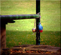
You know the party's over...by
KelliComment by Bruce_the_Robert: Since you asked in the thread for "critiques" (I'm not very good at these lately, I just follow my emotions, but as I know you're trying to understand this placement, I'll do my best): There are some really striking elements to this. The contrast between the lighting on the grass and the darkness of the railing is striking in a good way, made even more so by the retention of detail in the railing and the wooden flooring (it's dark enough for a strong contrast but not so dark that it's all shadow). The lines are distinct and angular, which adds emphasis to the sort of sadness that I feel from the party being over (there are my emotions again). I hope you can tell I like this shot (but as a team sucker, I'm probably not who you were wondering about); if I had voted, this would have been a 7 from me (which makes it above average, which is 6 for me, not 5).
So, what did others think? I wonder if some viewers had a theme problem here, as the balloons are deflated, and not just starting to deflate; the party's over, the balloons are "gone", but the theme is "beginning of the end." I wouldn't have thought of that if I wasn't trying to figure out why most people voted this a 5, and it's the only theme related answer I can think of.
There are also some technical things here that I might mention. I don't care for the "bevel" frame effect; the lighting in the frame on the left and top is distracting to my eye, and the shadow on the right and bottom is mostly lost (so it doesn't balance the light on the other sides for me). There also seem to be rather significant sharpening or contrast enhancement artifacts from the top of the vertical pole (both sides) down to where the balloon strings go around the pole. The beveled frame at the top exacerbates the effect for my eyes. There are also similar, though less pronounced, artifacts along the top of the vertical pole. All of this is a bit distracting if what you're doing is trying to judge technical aspects of the image (ie, if you're looking rather than seeing, which I think most DPCers do for fear of exposing themselves if they look deeper).
The composition on the shot is pretty good, and although it's not, it seems almost square. I agree with Tammer that a bit off the top might have helped. I downloaded this and ran my rule of thirds grid on it, and the pole is just inside the line, with the balloons at just about the mid-line (halfway up vertically). I cropped a bit off the top, a bit off the right, and bit off the bottom (using the third line tool as a guide), and I think a less square crop strengthened the composition somewhat; the balloons were just outside the right third, and the third line ran down the middle of the pole, which helped, too, I think. One note: I'm not criticizing you for not having followed the rule of thirds or anything like that; I always run my rule of thirds tool, but at least 1/3 of the time (or more) I pretty much ignore it (when it doesn't help the image). But I always check to see whether it will strengthen whatever composition I've come up with on my own, and lots of times it does.
Okay, let me reiterate: I like this image, it tells me a story and gives me a good feeling of melancholy (as I think such an image should). I especially like the sharp contrast, the textures and the colors. I hope that what I've identified other than these things helps you see what other DPC viewers might have seen!
Message edited by author 2007-11-05 09:29:35.